class: center, middle, inverse, title-slide .title[ # PADP 7120 Data Applications in PA ] .subtitle[ ## Data Visualization ] .author[ ### Alex Combs ] .institute[ ### UGA | SPIA | PADP ] .date[ ### Last updated: February 03, 2023 ] --- # Outline - Choosing the appropriate graphs - Guidelines of good visualization --- # Some Data |major | grad_median| |:-----------------------------------------------------------------|-----------:| |Electrical Engineering Technology | 85000| |Anthropology And Archeology | 65000| |Materials Engineering And Materials Science | 92000| |Electrical, Mechanical, And Precision Technologies And Production | 62000| |Library Science | 52000| - Includes 173 graduate degree majors --- # Choosing appropriate graph - Which graph might we use if we want to visualize the distribution of median pay? --- # Histogram .pull-left[ 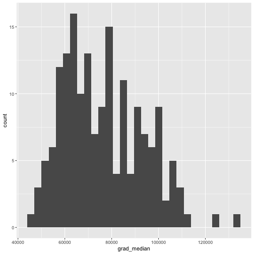<!-- --> ] .pull-right[ ```r ggplot(college_grad_students, aes(x = grad_median)) + geom_histogram(bins = 30) ``` ] --- # Exploratory vs. explanatory .center[ 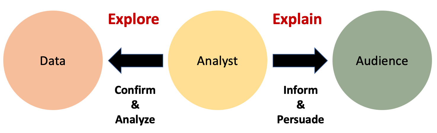 ] --- # An exploratory graph .pull-left[ 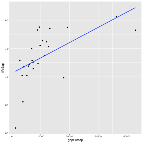<!-- --> ] .pull-right[ ```r ggplot(gm_americas, aes(x = gdpPercap, y = lifeExp)) + geom_point() + geom_smooth(method = "lm", se = FALSE) ``` ] --- # An explanatory graph .pull-left[ 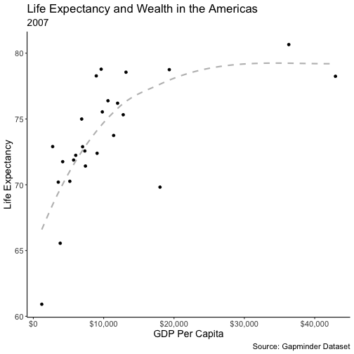<!-- --> ] .pull-right[ ```r ggplot(gm_americas, aes(x = gdpPercap, y = lifeExp)) + geom_point() + geom_smooth(se = FALSE, linetype = "dashed", color = "gray", span = 1) + scale_x_continuous(labels = scales::dollar) + labs(title = "Life Expectancy and Wealth in the Americas", subtitle = "2007", y = "Life Expectancy", x = "GDP Per Capita", caption = "Source: Gapminder Dataset") + theme_classic() + theme(text = element_text(size = 14)) ``` ] --- # Another graph for an audience .center[  ] --- # Qualities of good viz - Proper graph given the data - Display an accessible complexity of detail - Don't distort perception - Avoid content-free decoration--chart junk - Maximize data-to-ink ratio --- # Chart junk? .center[  ] --- # Distortion - Reproduction of a graph in the *New York Times* about a crisis in democracy .center[  ] --- # Distortion .center[  ] - Previous graph focused on the percentage of people who gave a rating of 10 --- # Distortion .center[  ] --- # Distortion - Law school enrollment trend .center[  ] - Consider how axes change the perception of scale. --- # Possible distortion .center[  ] - Depending on context, bar charts can lead people to think values inside the bars are more likely than values above. - More examples of bad graphs can be found [here](https://badvisualisations.tumblr.com) --- class: inverse, middle, center # Human perception has strengths and weaknesses --- # Decoding numerical visualization .center[  ] - Why simple (i.e., one or two variables) bar graphs or scatterplots are typically better. --- # Example .center[  ] - Easily compare totals and bottom category, but other three are difficult to compare across bars. - Also difficult to compare within bars. - Dodged bar chart would be better. --- # Example ``` ## Warning: ggrepel: 1 unlabeled data points (too many overlaps). Consider ## increasing max.overlaps ``` <img src="Visualizations_files/figure-html/unnamed-chunk-10-1.png" style="display: block; margin: auto;" /> --- # Example ``` ## Warning: ggrepel: 1 unlabeled data points (too many overlaps). Consider ## increasing max.overlaps ``` <img src="Visualizations_files/figure-html/unnamed-chunk-11-1.png" style="display: block; margin: auto;" /> --- # Decoding categorical visualization .center[  ] --- # Find the blue circle .center[  ] --- # Find the blue circle .center[  ] --- # Find the blue circle .center[  ] --- # Find the blue circle .center[ 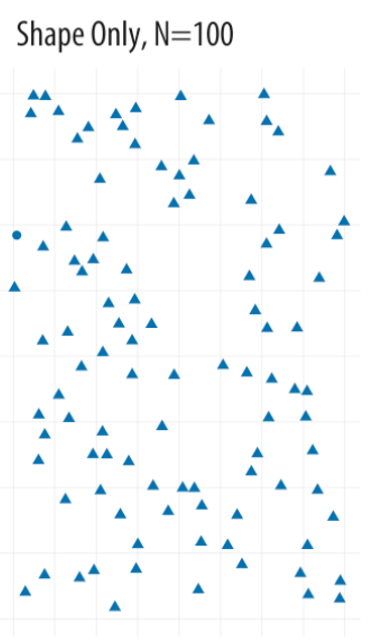 ] --- # Find the blue circle .center[ 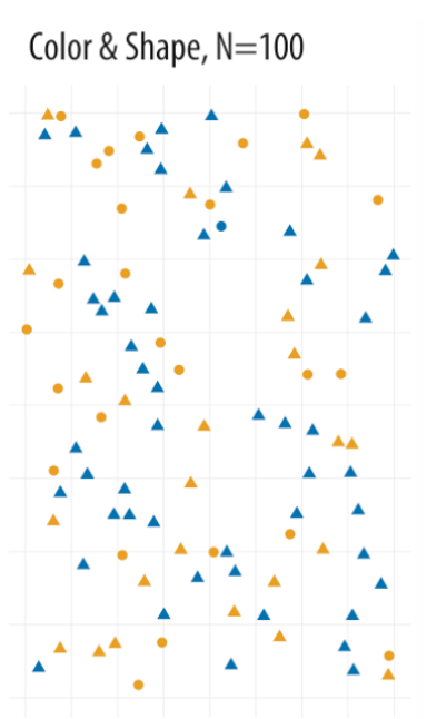 ] --- class: inverse, middle, center # Let's consider a few graphs you all made in R Chapter 5 --- # Number of counties by state 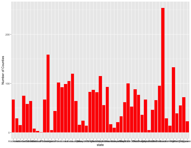<!-- --> --- # Number of counties by state 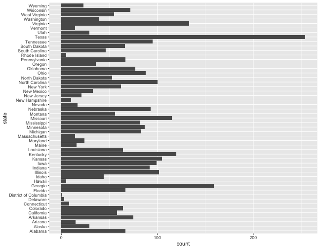<!-- --> --- # Number of counties by state 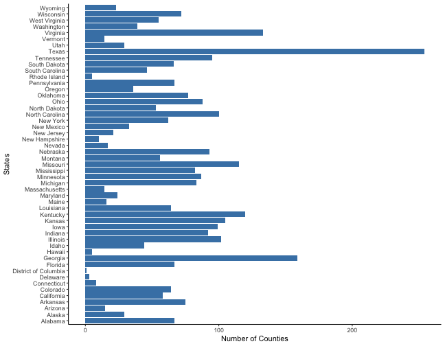<!-- --> --- # Scatterplot 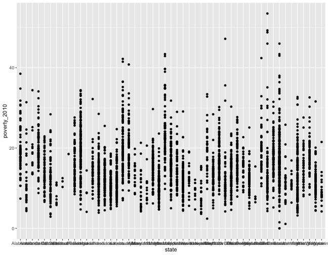<!-- --> --- # Scatterplot 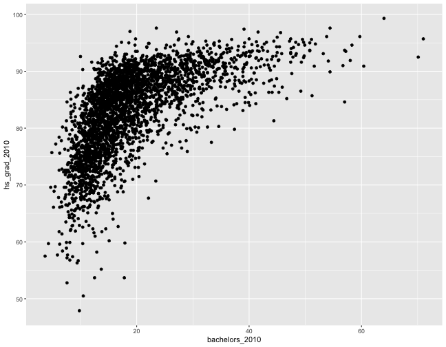<!-- --> --- # Scatterplot 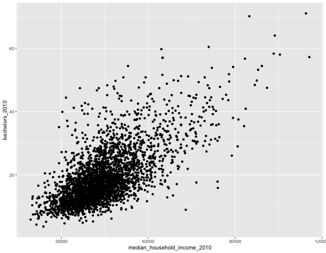<!-- --> --- # Scatterplot 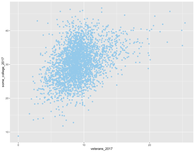<!-- --> --- # Scatterplot 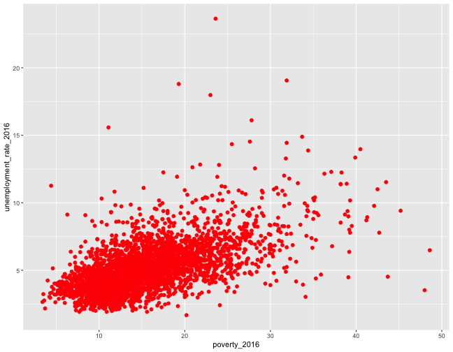<!-- --> --- # Scatterplot 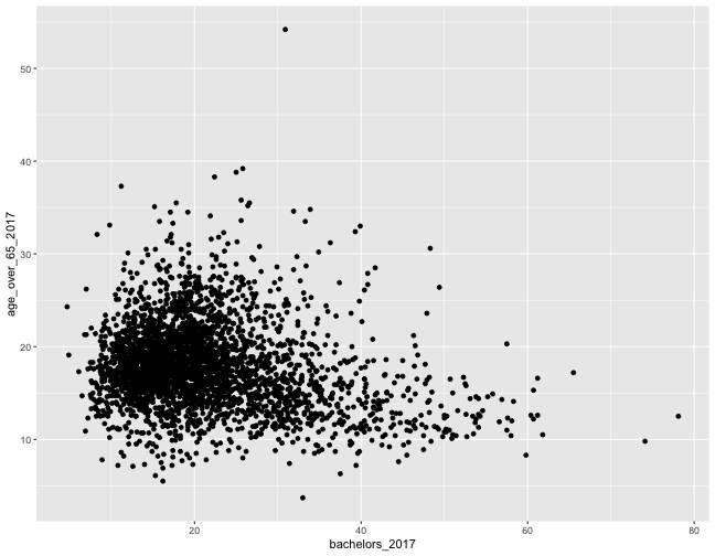<!-- -->