14 Forecasting
“Forecasting is the art of saying what will happen, and then explaining why it didn’t!”
—Anonymous; Balaji Rajagopalan
Previous chapters primarily used cross-sectional data to demonstrate various applications. Those applications fundamentally apply to time series and panel data as well. However, time series and panel data contain additional information, opening a vast array of additional methods that go far beyond the scope of this book.
This and the next chapter offer narrow coverage of two common, yet potentially advanced data applications in public administration: forecasting with time series data and fixed effects analysis with panel data. The intent is to provide the readers a few skills to conduct or understand basic analyses in each scenario.
14.1 What is forecasting
Recall in Chapter 2 that time series measures one or more characteristics pertaining to the same subject over time. Therefore, the unit of analysis is the unit of time over which those characteristics are measured.
| country | continent | year | lifeExp | pop | gdpPercap |
|---|---|---|---|---|---|
| United States | Americas | 1987 | 75.020 | 242803533 | 29884.35 |
| United States | Americas | 1992 | 76.090 | 256894189 | 32003.93 |
| United States | Americas | 1997 | 76.810 | 272911760 | 35767.43 |
| United States | Americas | 2002 | 77.310 | 287675526 | 39097.10 |
| United States | Americas | 2007 | 78.242 | 301139947 | 42951.65 |
Forecasting involves making out-of-sample predictions for a measure within a time series. Throughout the chapters on regression, we made out-of-sample predictions each time we computed the predicted value of the outcome in our regression, \(\hat{y}\), for a scenario not observed in our sample. Forecasting is no different in this regard. It is specific to predictions with time series data. Since the unit of analysis in time series data is a unit of time, an out-of-sample prediction involves a time period unobserved in our sample (i.e. the future).
Analyses can seek to predict, to explain, or both. Keep in mind that forecasting is typically focused on prediction rather than explanation. Would it be helpful to know why an outcome is the value that it is in most cases? Certainly, but good decisions can be made by knowing what to expect regardless of why. Moreover, the benefits of modeling a valid explanatory model may not exceed the costs of delaying accurate predictions.
If the focus is solely prediction, then we do not need to concern ourselves with internal validity or omitted variable bias. Frankly, we do not care if our model makes theoretical sense as long as its predictions are accurate. While this frees us from many constraints, it makes goodness-of-fit even more important. Therefore, the primary focus of this chapter is how to identify a good forecast model and how to choose the best model among multiple good models.
Lastly, keep in mind that a forecasting also relies on confidence intervals. Whereas explanatory regression places focus on the confidence intervals around the estimated effect of an explanatory variable on an outcome, forecasts focus on the confidence intervals around the predicted value of the outcome. These confidence intervals convey the range of values that our forecast model expects the future outcome to fall within some percentage of simulated futures.
14.2 Patterns
We rely on patterns to make good forecasts. A time series that exhibits no patterns offers no information for predicting the future. Time series can exhibit the following three types of patterns:
- Trend: a long-term increase or decrease
- Seasonal: a repeated pattern according to a calendar interval usually shorter than a year
- Cyclic: irregular increases or decreases over unfixed periods of multiple years
With a time series of U.S. GDP in Figure 14.1, we can see two of the aforementioned patterns. First, there is an obvious upward trend. Secondly, there appear to be irregularly spaced plateaus or dips, most of which represent economic recessions. Recessions exhibit a cyclical pattern. Phenomena related to weather or holidays, such as energy production, consumption, and travel, are likely to exhibit seasonal patterns like the sales data shown in Figure 14.2 below.
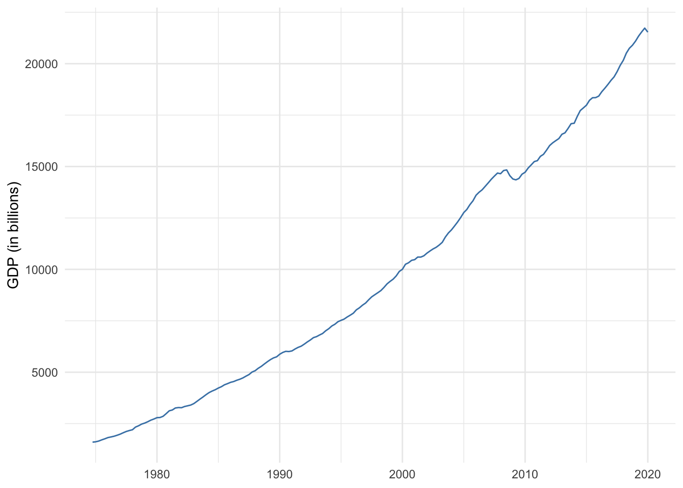
Figure 14.1: U.S. GDP 1975-2019
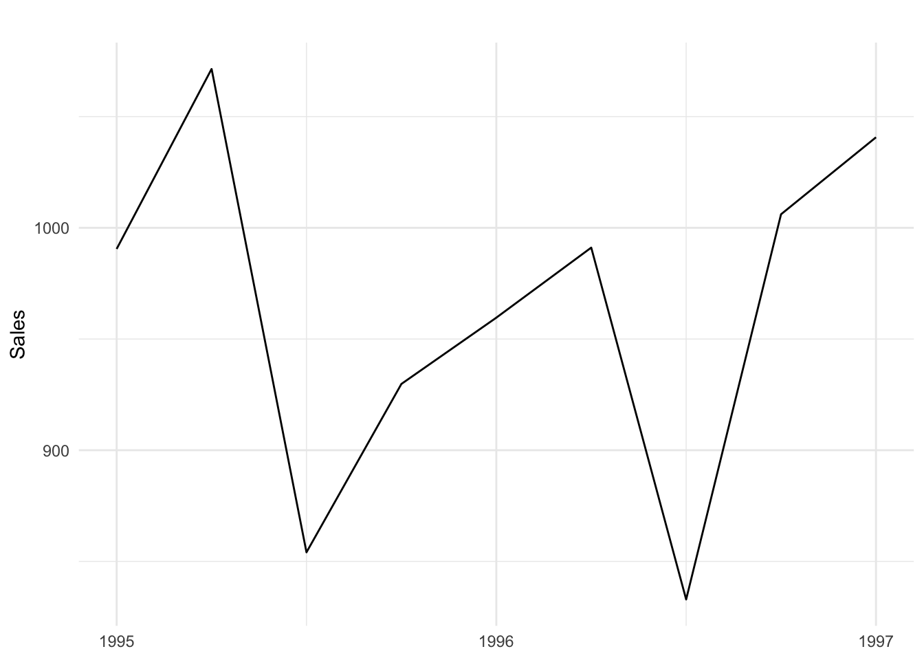
Figure 14.2: Sales data
14.2.1 Autocorrelation
Again, it is useful for forecasts if a time series exhibits a pattern. Another way to think of a pattern is that past values provide some information for predicting future values.
Whereas correlation measures the linear association between two variables, autocorrelation measures the linear association between an outcome and past values of that outcome. We can use an autocorrelation plot to examine if past values appear to predict future values.
Figure 14.3 below is an autocorrelation plot of U.S. GDP. For all measurements along the time series of GDP, the autocorrelation plot quantifies the correlation between a chosen “current” GDP and past measurements of GDP called lags. Figure 14.3 goes as far as 22 lagged measures. The blue dashed line denotes the threshold at which the correlations are statistically significant at the 95% confidence level.
We can see that the first lag of GDP is almost perfectly correlated with current GDP. In other words, last quarter’s GDP is a very strong predictor of current GDP. The strength of the correlation decreases over time but remains statistically significant. This gradual decrease in autocorrelation is indicative of time series with a trend pattern.
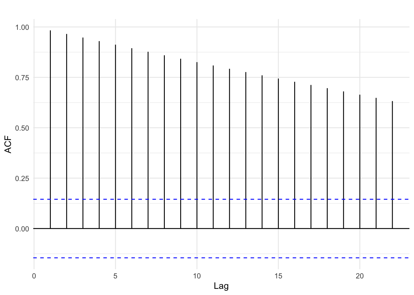
Figure 14.3: Autocorrelation of U.S. GDP
Figure 14.3 below shows the autocorrelation from the quarterly sales time series that exhibited a seasonal pattern. The autocorrelation plot suggests that each even-numbered lag is correlated with the current sales measure, switching between negative and positive each time. This peak and valley pattern is common in seasonal data.
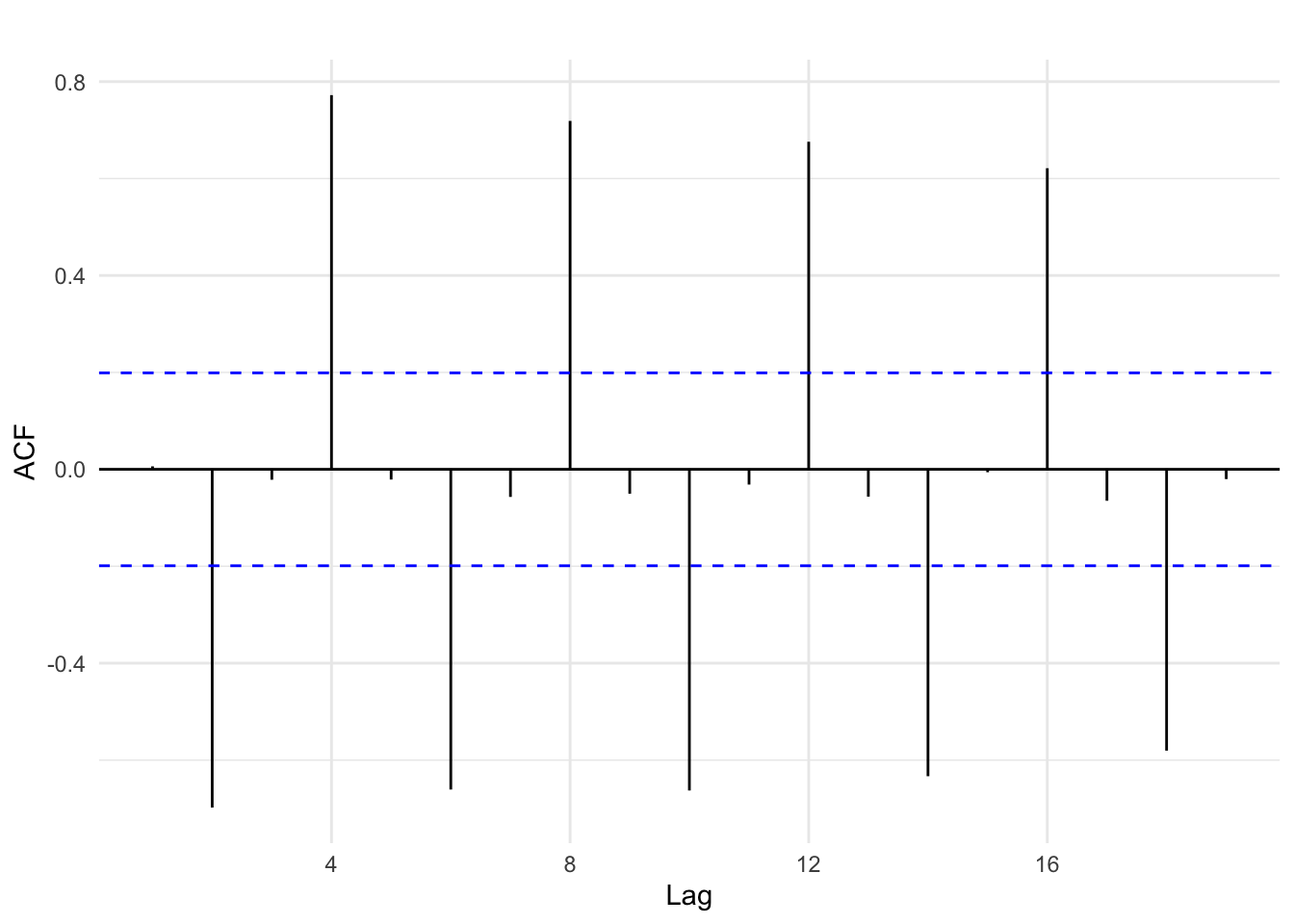
Figure 14.4: Autocorrelation of sales
In each of the examples above, we can use information from the past to predict the future. A time series that shows no autocorrelation is called white noise. White noise provides us no significant information about predicting the future. Figures 14.5 and 14.6 below provide an example of white noise. Note there is no discernible pattern in the time series plot and no autocorrelations are statistically significant.
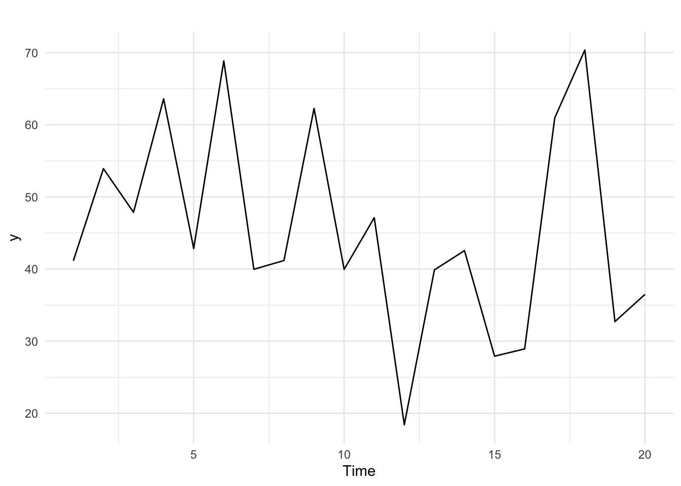
Figure 14.5: White noise time series
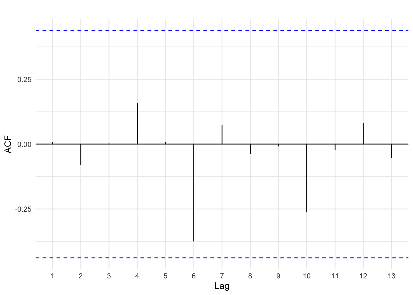
Figure 14.6: Autocorrelation of white noise
14.3 Forecasting basics
Forecasts use past observed data to predict future unobserved data. If time series exhibits a pattern such that autocorrelation is present, we can use the past to improve predictions of the future.
14.3.1 Evaluation
The central goal of a forecast is to provide the most accurate prediction. How can we evaluate the accuracy of our predictions if the future events have not occurred? As was the case in previous chapters on regression, a forecast essentially draws a line through data. We can get a sense of how accurate our forecast model is by comparing its predictions to observed values. That is, we can use the residuals of a forecast model to evaluate its goodness-of-fit. A better fitting model is expected to generate more accurate predictions, on average.
Residuals
Figure 14.7 shows a forecast model denoted by the red line that simply uses the previous GDP measure to predict current GDP, compared to observed GDP denoted by the blue line. Recall how strongly lagged GDP was correlated with current GDP. This results in a forecast that appears to fit the trend fairly well. Nevertheless, there is error for almost every year, and since GDP in this time window exhibits a consistent upward trend, using last year’s GDP causes a consistent underestimation.
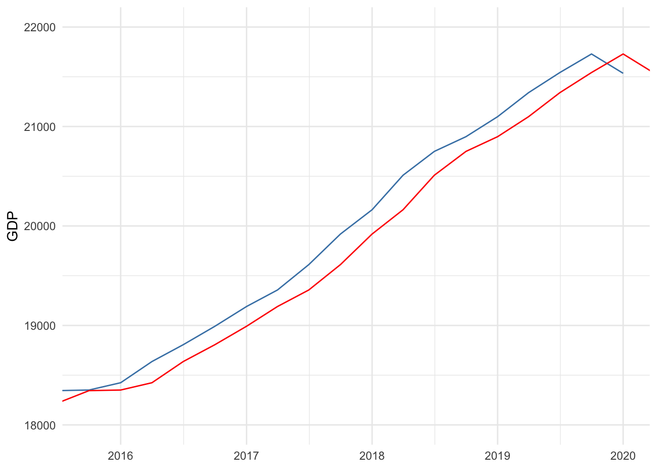
Figure 14.7: Comparing observed to predicted
Figure 14.8 below plots the residuals between observed and predicted GDP–the vertical distance between blue and red lines–in the top panel. The bottom-left panel is a autocorrelation plot for the residuals–computing the correlation between current residuals and lagged residuals–and the bottom-right panel shows the histogram of the residuals.
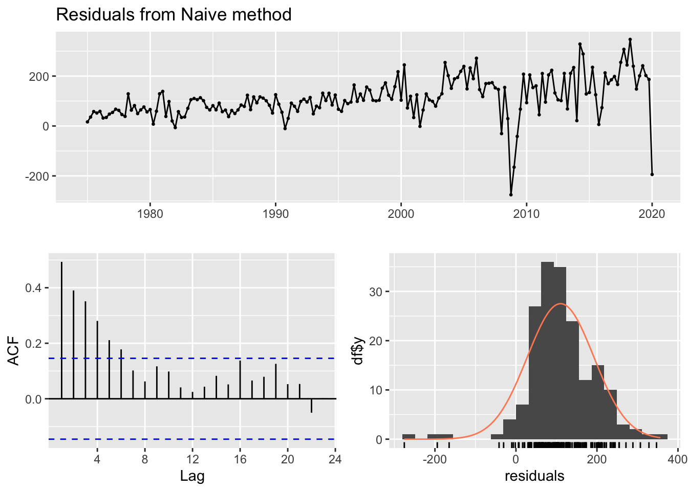
Figure 14.8: Residual diagnostics
Figure 14.8 provides a lot of useful information related to the central goal of forecasting. In order for us to conclude we have a good forecast, two goals must be met:
- The time series of residuals should be white noise, and
- the residuals should have a mean approximately equal to zero.
It is difficult to tell from the top panel of Figure 14.8 whether these goals are met. However, notice that the residuals are almost always positive, which we would expect since we know our forecast almost always underestimates GDP. Therefore, the mean is certainly greater than zero, as can be seen in the histogram.
The autocorrelation plot of the residuals suggests that residuals lagged up to six time periods is significantly correlated with current residuals. This is further evidence that the time series of our residuals is not white noise.
A good forecast extracts as much information from past data as possible to predict the future. If it fails to do so, then lagged residuals will be correlated with current residuals. Therefore, our simple forecast for GDP has not extracted all the information from the past that could inform future predictions, resulting in a sub-par forecast.
Root Mean Squared Error
Multiple models could achieve residuals that are white noise and have a mean equal to zero. We can further evaluate forecast models by comparing their root mean squared errors (RMSE). Recall from Chapter 6 that the RMSE quantifies the typical deviation of the observed data points from the regression line and is analogous to the standard deviation or standard error measures. In fact, the 95% confidence interval around a forecast is based on two RMSEs above and below the point forecast, just as two standard errors are used to construct a 95% confidence interval around a point estimate in regression.
Table 14.2 shows a set of standard goodness-of-fit measures for our simple forecast of GDP. We will only concern ourselves with RMSE. According to the results, the point forecast of our model is off by plus-or-minus 137 billion dollars, on average. If we developed a model with a smaller RMSE, we would prefer it to this model, provided its residuals behave no worse.
| ME | RMSE | MAE | MPE | MAPE | MASE | ACF1 | |
|---|---|---|---|---|---|---|---|
| Training set | 110.1394 | 137.2821 | 118.1553 | 1.421887 | 1.475215 | 0.2562912 | 0.4933519 |
14.3.2 Models
There are four basic forecasting models:
- Mean: future outcomes predicted to equal the average of the outcome over the entire time series
- Naive: future outcomes predicted to equal the last observed outcome
- Drift: draws a straight line connecting the first and last observed outcome and extrapolates it into the future
- Seasonal naive: same as naive but predicts each future season to equal its last observed season
Figures 14.9, 14.10, and 14.11 below demonstrate the mean, naive, and drift forecast models applied to U.S. GDP, respectively. It should be obvious that using the mean is a poor choice and will be for any time series with a strong trend pattern. Under normal circumstances absent of an impending economic shutdown, we would likely conclude that the drift model provides a more accurate forecast than the naive model.
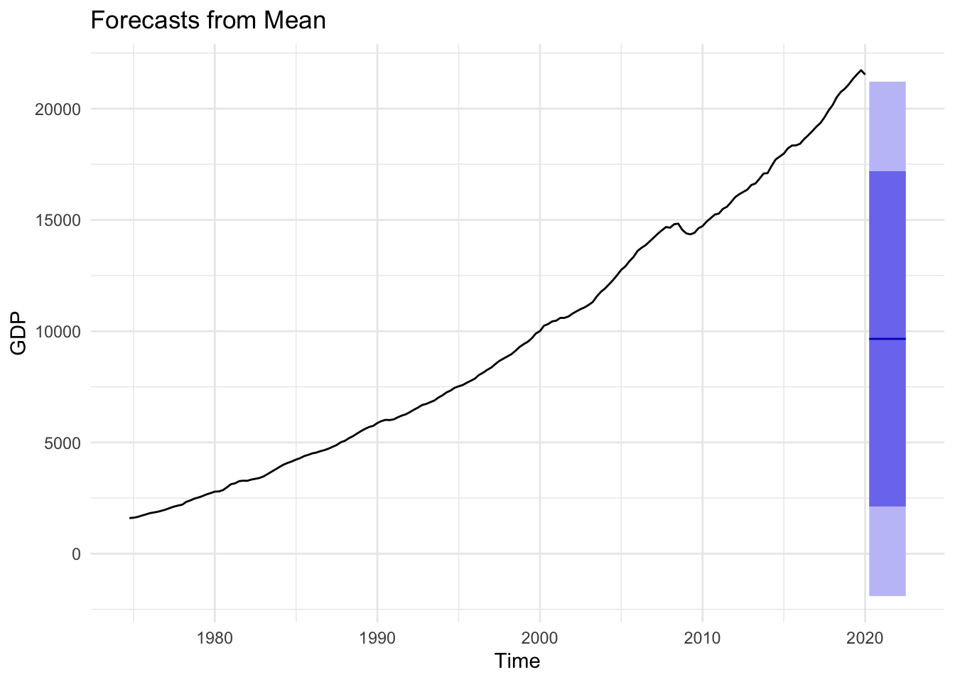
Figure 14.9: Mean Forecast
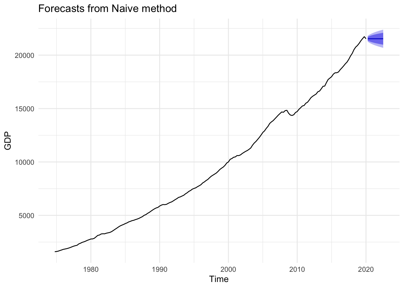
Figure 14.10: Naive Forecast
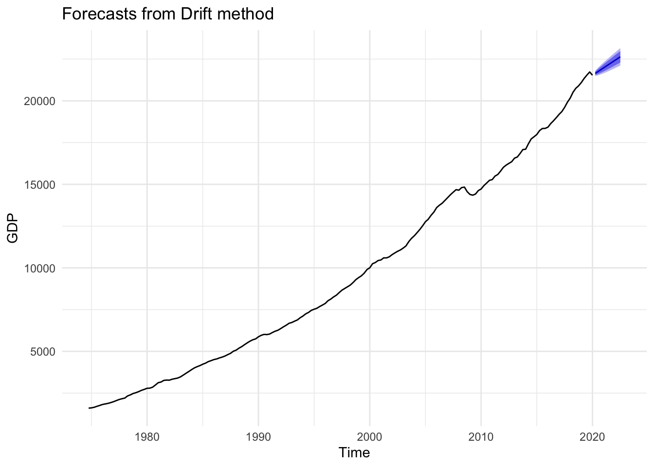
Figure 14.11: Drift Forecast
According to the drift model, predicted GDP for the next ten time periods is shown in Table 14.3. Again, this is not a sophisticated model, and some may be alarmed by making predictions based on simply connecting the first and last observations, then extending the line into the future. It is important to keep in mind that the utility of a forecast is not the exact point forecasts in Table 14.3. In fact, it would be misleading to report GDP in Q2 of 2020 is predicted to be 21.65 trillion dollars. The utility of a forecast is the corresponding confidence interval. If this is our best model, then we can report that GDP in Q2 of 2020 is predicted to be between 21.48 and 21.81 trillion dollars with 95% confidence.
| Point Forecast | Lo 80 | Hi 80 | Lo 95 | Hi 95 | |
|---|---|---|---|---|---|
| 2020 Q2 | 21645.05 | 21539.44 | 21750.65 | 21483.54 | 21806.55 |
| 2020 Q3 | 21755.19 | 21605.43 | 21904.94 | 21526.15 | 21984.22 |
| 2020 Q4 | 21865.33 | 21681.41 | 22049.24 | 21584.05 | 22146.60 |
| 2021 Q1 | 21975.46 | 21762.52 | 22188.41 | 21649.80 | 22301.13 |
| 2021 Q2 | 22085.60 | 21846.89 | 22324.32 | 21720.51 | 22450.69 |
| 2021 Q3 | 22195.74 | 21933.54 | 22457.95 | 21794.73 | 22596.75 |
| 2021 Q4 | 22305.88 | 22021.91 | 22589.85 | 21871.59 | 22740.18 |
| 2022 Q1 | 22416.02 | 22111.64 | 22720.41 | 21950.51 | 22881.54 |
| 2022 Q2 | 22526.16 | 22202.46 | 22849.86 | 22031.10 | 23021.22 |
| 2022 Q3 | 22636.30 | 22294.19 | 22978.41 | 22113.09 | 23159.51 |
Perhaps more sophisticated methods would provide a better forecast model. If so, then the model will fit observed data better, resulting in more precise confidence intervals. Greater precision could indeed be valuable depending on the context, as many decisions can be aided by considering best- and worst-case scenarios. Nevertheless, as long as our model achieves residuals that look like white noise with a mean approximately equal to zero, we can be fairly confident that our model is not wildly inaccurate though it may be less precise than an alternative model.
Let us check the residuals for our drift model. As can be seen in Figure 14.12, the mean of the residuals is approximately zero, but it appears that there is still information in past measures not extracted by our simple drift model. These results suggest we should try to improve our model.
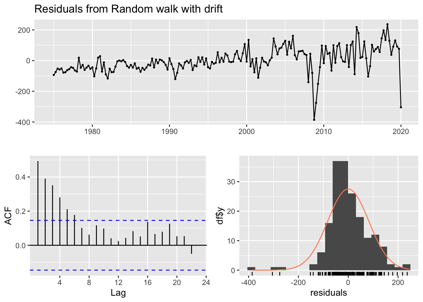
Figure 14.12: GDP drift residuals
The figures below compare mean, naive, and seasonal naive models using the seasonal sales data from earlier. Because this time series does not exhibit a clear trend, the mean model is not as obviously bad as it was with GDP, though it is highly imprecise. The same applies to the naive model. If we care about predicting specific seasons (i.e. quarters), then clearly the seasonal naive model is the preferred choice.
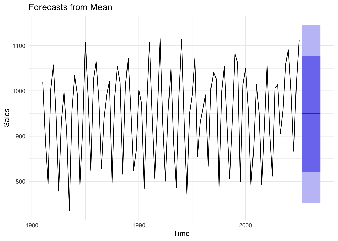
Figure 14.13: Comparison of forecast models to seasonal data
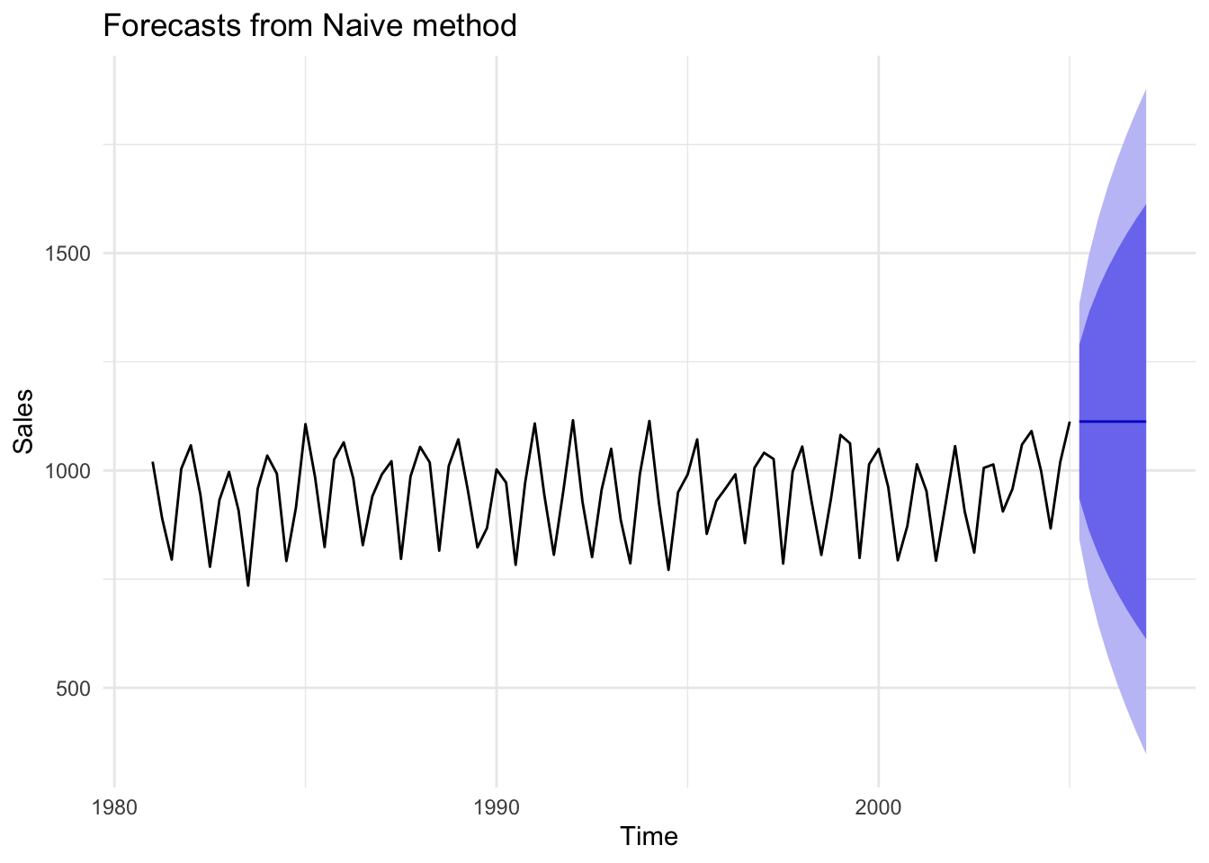
Figure 14.14: Comparison of forecast models to seasonal data
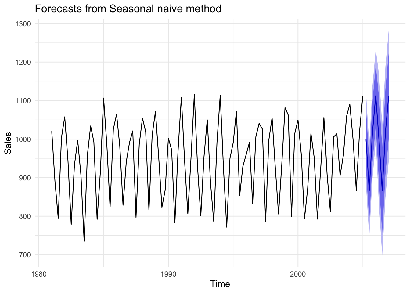
Figure 14.15: Comparison of forecast models to seasonal data
Let us check the residuals of the seasonal naive model. The residuals have a mean of zero, and with the exception of one significantly correlated residual for lag 4, it appears we have mostly white noise. This model may be sufficient in many cases. The fact that sales from a year ago still provide information for current sales suggests there may be an annual trend component to this time series that our seasonal naive model does not extract. Therefore, a better model is achievable.
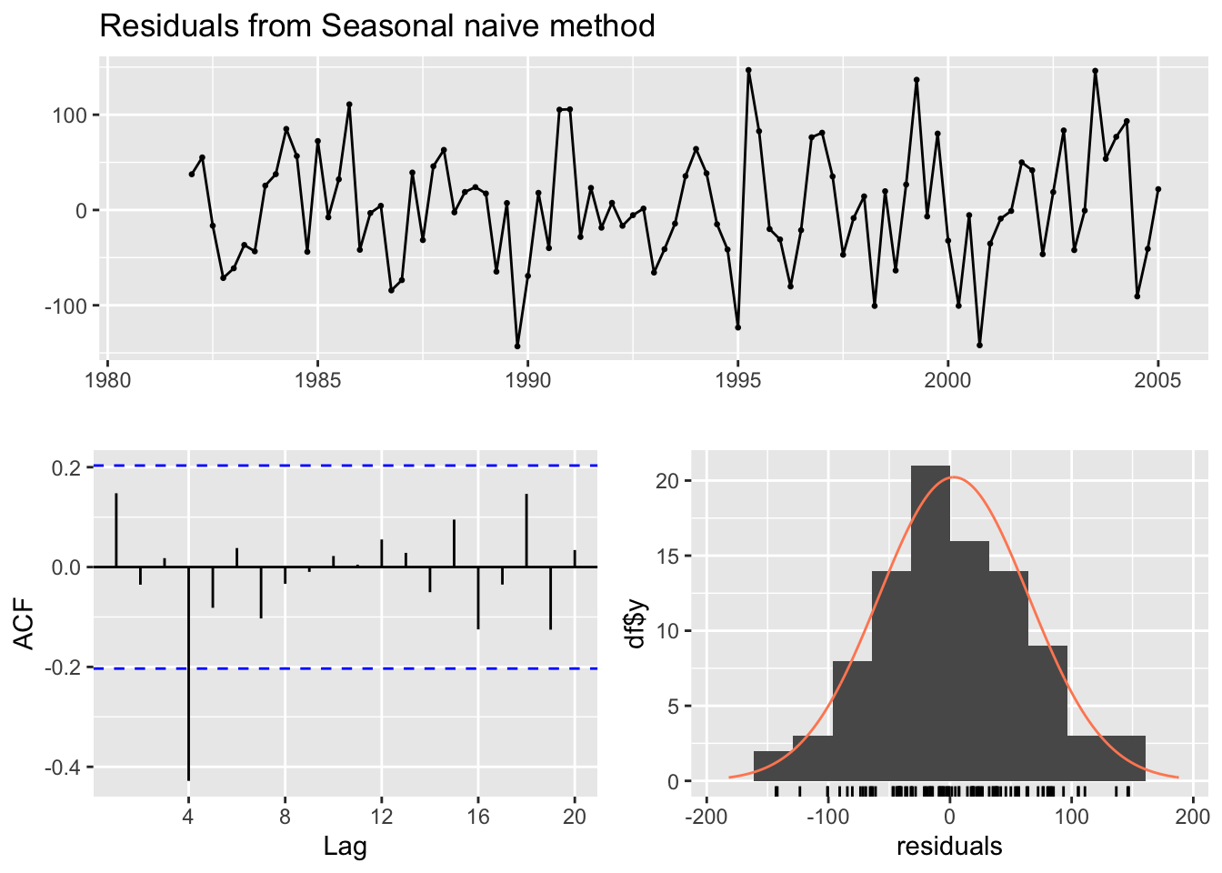
Figure 14.16: Residual check
14.4 Recap
We have only scratched the surface of forecasting. The corresponding R Chapter covers how to implement the models and plots above as well as incorporating explanatory variables into a forecast model.
Here are the key takeaways from this chapter:
- Prediction does not care about the theory of a model.
- Patterns in time series contain information that can be used to predict the future.
- A good forecast model extracts all useful information from the past to predict the future. If this is achieved, the residuals from our forecast will look like white noise and have a mean equal to zero.
- The best model among competing good models is the model with the smallest RMSE.