5 Data Visualization
“The pen is mightier than the sword, especially if it draws a graph.”
The world of data visualization is incredibly diverse and detailed. You could spend a substantial amount of time learning how to construct the best visualization given particular data and the the intended message. Such depth is far beyond the scope of this book. For more coverage on data visualization, I recommend the following resources:
At a basic level, most choices of visualization can be determined based on:
- The kind of description or comparison we want to visualize, and
- the type(s) of variable(s) involved in the visualization.
Figure 5.1 below provides a decision tree organized according to these two considerations. This chapter is roughly organized according to this decision tree.
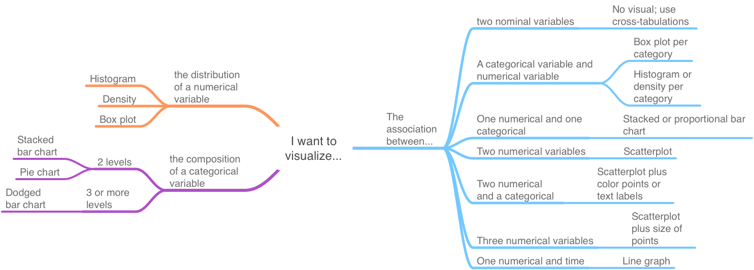
Figure 5.1: Basic data viz decisions
Note that the first branch of Figure 5.1 is dictated by whether we want to visualize one variable or the association of two or more variables. The left side pertains to one variable – the visualization of which depends on whether it is a categorical or numerical variable. The right side pertains to visualizing the association of two or more variables. Which graph is arguably best then depends on the type of variables involved in the association.
5.1 Learning objectives
- Interpret the six common visualizations from Figure 5.1
- Histogram
- Box plot
- Pie chart
- Bar chart
- Line graph
- Scatter plot
- Recommend an appropriate type of visualization given the intended message and data
5.2 Distribution of numerical variables
This section refers to the top-left section of Figure 5.1 where we want to visualize how the values of a single numerical variable are distributed along its (possible) range of values.
5.2.1 Histogram
You have already seen several histograms. A histogram visualizes the distribution of a single variable by counting the number of occurrences for values that fall within a certain range. The frequency of occurrences within each range is represented by a vertical rectangle.
Figure 5.2 shows the median earnings of those employed full time for different graduate degree majors. We can see that most graduate degrees result in a median pay for graduates of between 60 and 80 thousand dollars. There are a few graduate majors for which the median pay is above 100 thousand dollars.
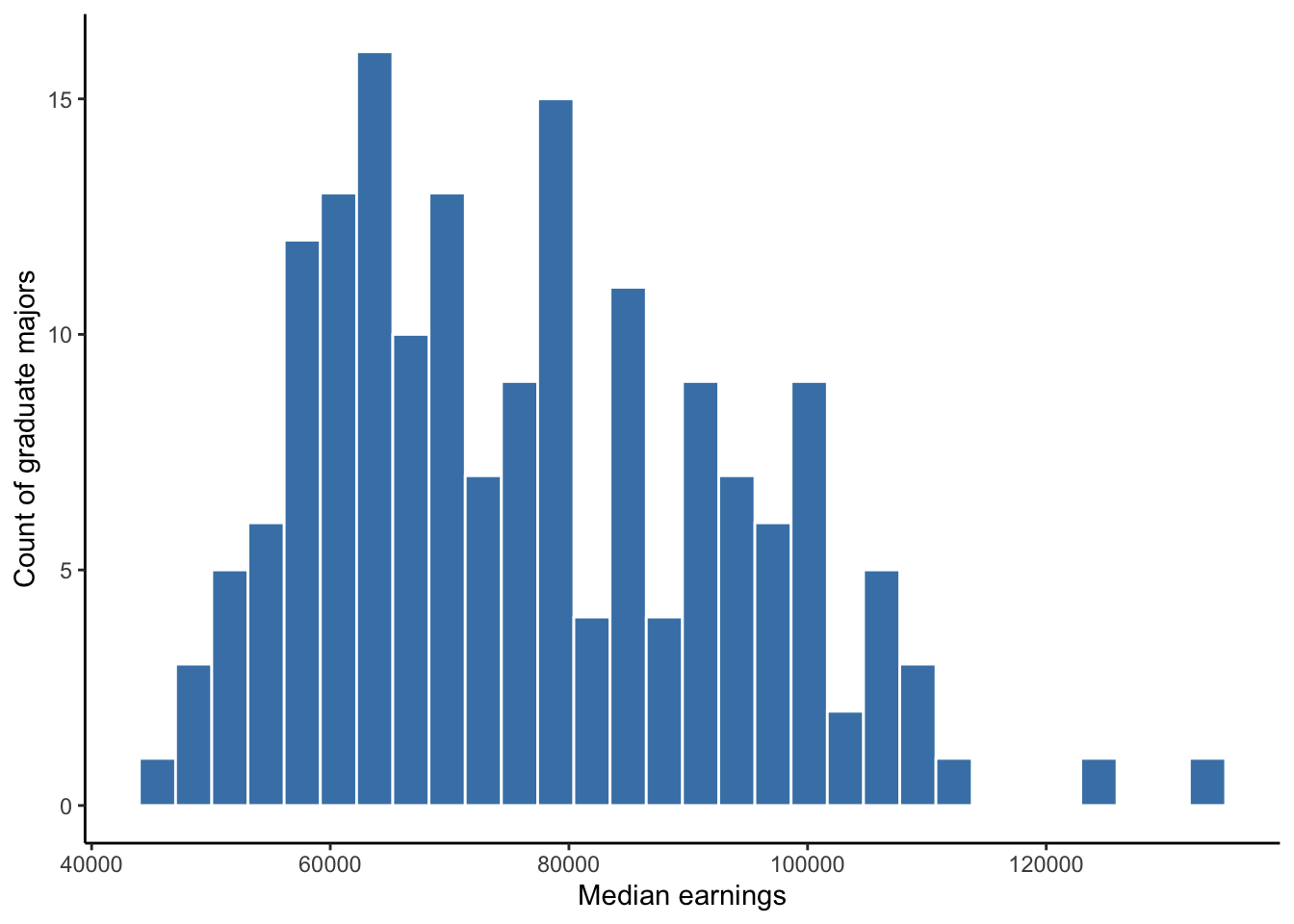
Figure 5.2: Histogram of full-time median earnings for different graduate school majors
These rectangles are called bins and the horizontal range each rectangle covers is called a binwidth. We can specify the number of bins and/or the binwidth. If we have more than 150 observations of a continuous variable, we may want to specify as many as 100 bins but should experiment with this number depending on the particular distribution of the variable. If we have less than 30 observations, we should not use a histogram. If we have more than 30 but less than 150 observations, we should experiment with some number of bins between 30 and 100. Regarding binwidth, if our variable is discrete, then our binwidth should equal some integer width of the variable. For example, if our variable is a count of weeks, then our binwidth could equal 1 so that each bin contains one week or some range of multiple weeks.
5.2.2 Box plot
A box plot (or box-and-whiskers plot) is similar to the histogram and density plot, but a box plot tries to combine a complete view of a distribution and several visual markers denoting some of the descriptive measures covered in Chapter 4. Figure 5.3 shows the median pay data.
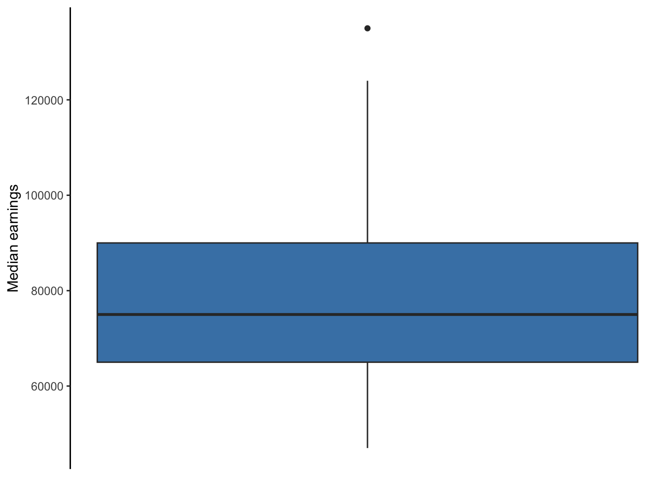
Figure 5.3: Box plot of full-time median earnings for different graduate school majors
The line in the middle of the box denotes the median of the variable’s distribution. The top and bottom edges of the box denote the 75th and 25th percentiles, respectively. Therefore, the length of the box denotes the IQR of the variable’s distribution. The whiskers of a boxplot extend 1.5 times the length of the box (IQR). This \(1.5 \times IQR\) is a standard threshold to identify extreme values also known as outliers. If a variable contains values beyond this threshold, a box plot will single them out with dots beyond the end of the whisker. Figure 5.3 above shows us that one graduate major is a outlier using this \(1.5 \times IQR\) definition.
5.3 Compostion of a categorical variable
Suppose we deemed a graduate degree for which 5% or more of its graduates are unemployed to be a “high” unemployment degree, and those with an unemployment rate less than 5% as a “low” unemployment degree. We have 173 graduate degree majors. Suppose we want to visualize the composition of this categorical unemployment variable.
We are now in the bottom-left section of Figure 5.1. A categorical variable has two more more levels. Some count or proportion of our observations belong to one level, while another count or proportion of our observations belong to a different level. If we wish to visualize the composition of these counts/proportions, we can use the following graphs.
5.3.1 Pie charts
Pie charts are much derided. This derision is due to the fact that pie charts are often misused. Pie charts are acceptable if you want to show the composition of one categorical variable for which there are no more than 3 levels, though preferably no more than 2 levels. We should never use pie charts to compare the composition of a categorical variable between two groups or time periods (i.e., placing two or more pie charts next to each other for our audience to compare). Figure 5.4 shows the composition of our unemployment variable.
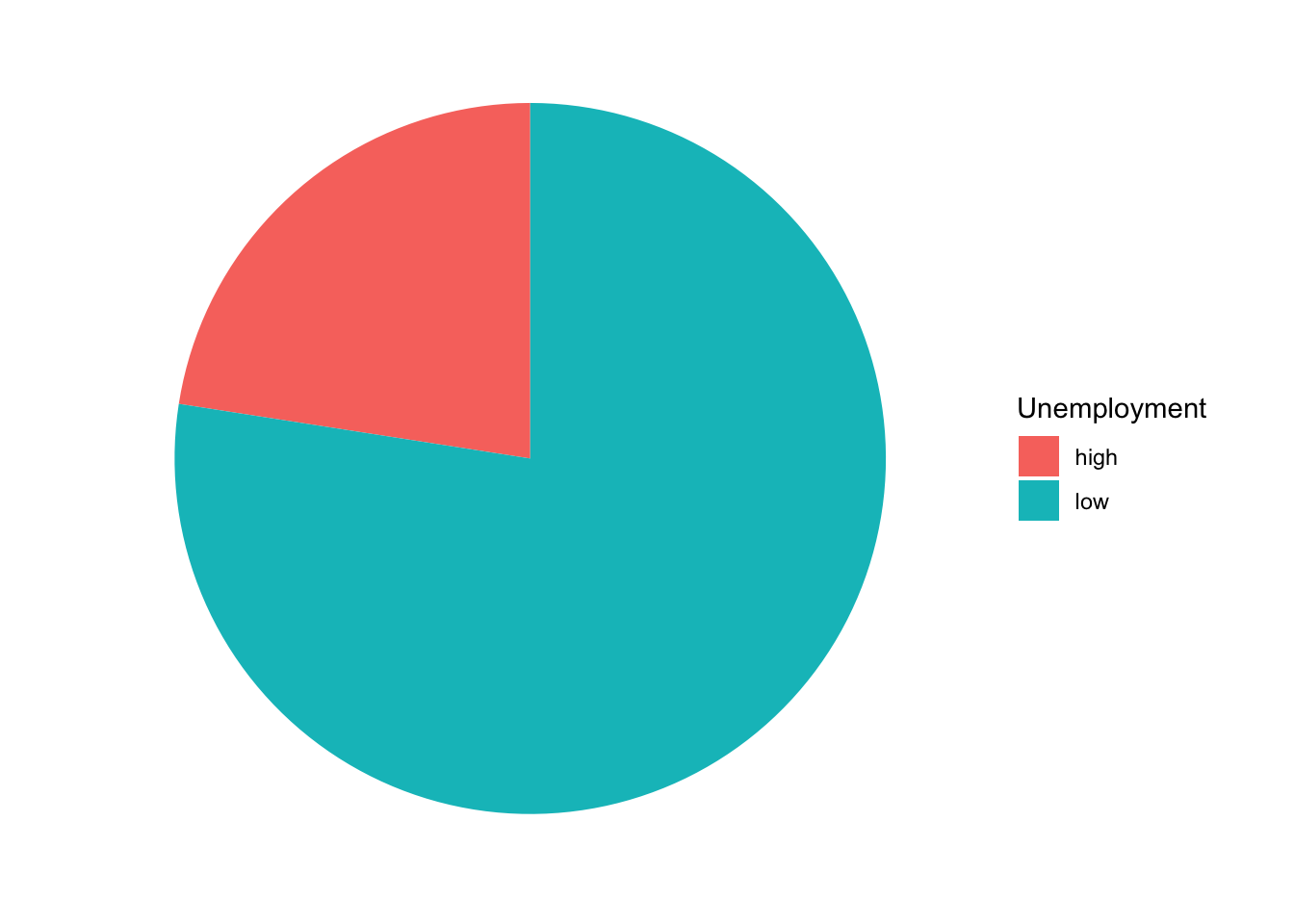
Figure 5.4: Graduate degrees with high/low unemployment
5.3.2 Bar chart
Bar charts can be used to present the same information as a pie chart. Moreover, bar charts are easier to interpret, can handle any number of levels, can present data as proportions or total counts, and can be used to compare across groups or time. In short, bar charts are better than pie charts, and we should choose bar charts unless someone forces us to use a pie chart for some reason.
The figures below show the three general types of bar charts. Figures 5.5 and 5.6 are both stacked bar charts but differ by how the y-axis is displayed. Figure 5.5 uses the count of degrees, while Figure 5.6 uses the proportion of total degrees. Figure 5.7 presents the same information as Figure 5.5, but instead of stacking the bars, it uses a dodged option.
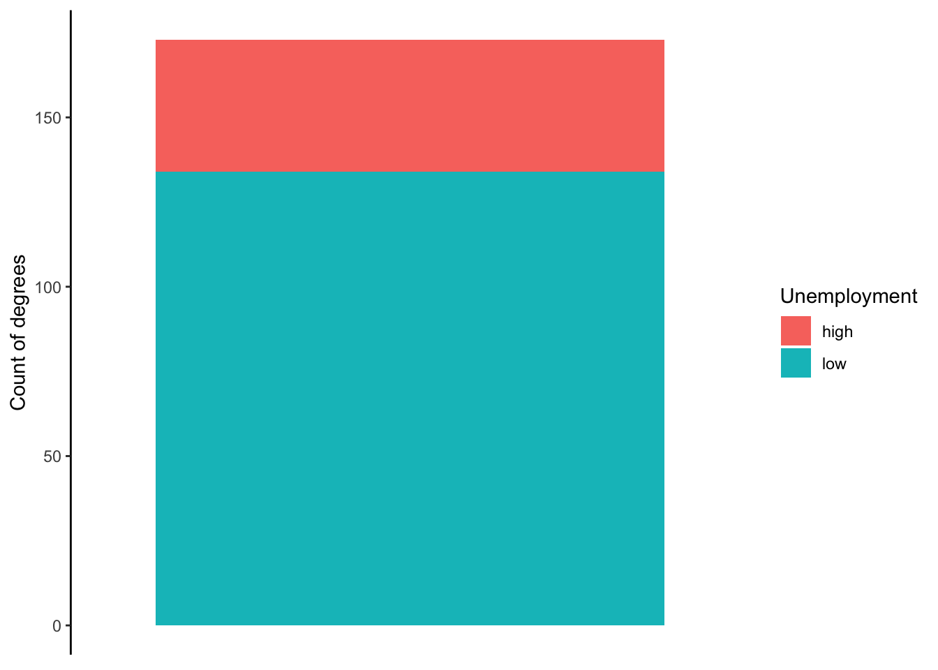
Figure 5.5: Graduate degrees with high/low unemployment
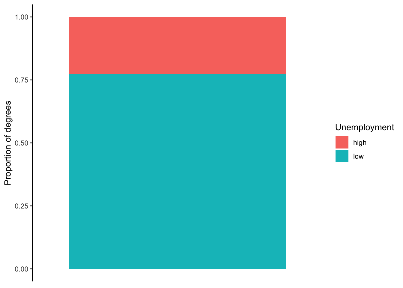
Figure 5.6: Graduate degrees with high/low unemployment
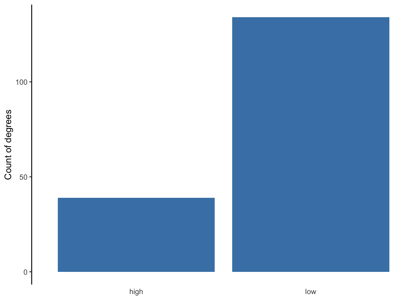
Figure 5.7: Graduate degrees with high/low unemployment
The differences between the three bar charts influence what information is emphasized and easier for an audience to interpret. The first stacked bar chart is best at showing us how many degrees are in our sample while also giving us some sense of how many fall into each level. The second bar chart does not tell us how many degrees are in our sample, but it is the most effective at providing us the proportion or percent of degrees that fall into each level. The dodged bar chart is not necessarily an improvement over either of the previous two. If there were more than two levels to the categorical variable, the dodged bar chart would be best.
5.4 Association
The above graphs visualize summary information about a single variable. This kind of information is often conveyed via tables. However, when associations between variables need to be conveyed, a graph can be much more effective than numbers in a table. Associations are patterns, and patterns are easier to detect visually.
5.4.1 One categorical and one numerical
5.4.1.1 Bar chart
Suppose we wanted to compare the median pay (numerical) between two or more graduate degrees (nominal). A bar chart is a good choice.

Figure 5.8: Comparison of median pay between degrees in public and international affairs
5.4.1.2 Dot plot
Dot plots serve the same purpose as bar charts, but are more appropriate for variables that measure something we would not naturally stack up for counting purposes. That is, money is stackable–we could imagine each bar as a stack of cash. By contrast, unemployment rates are not something we would stack on top of each other.
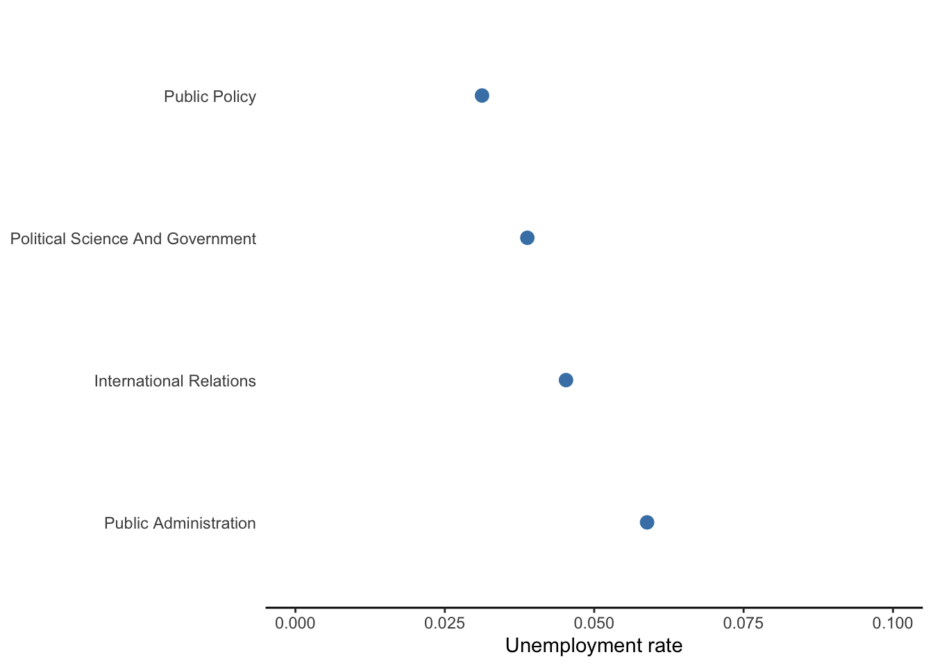
Figure 5.9: Comparison of unemployment rates between degrees in public and international affairs
5.4.1.3 Box plot or histogram
The bar charts above intend to compare a few values of a numerical variable. If we had many values, we may wish to compare the entire distribution between levels of a categorical variable. In that case, a box plot or histogram can be used.
Suppose we wanted to visualize the association between attaining a graduate degree or not (ordinal) and median pay (numerical). We can use a box plot to visualize the distribution of median pay for employees with undergraduate degrees in the 173 majors in our data and the distribution of median pay for employees with a graduate degree in those same majors. Figure 5.10 below does just that.
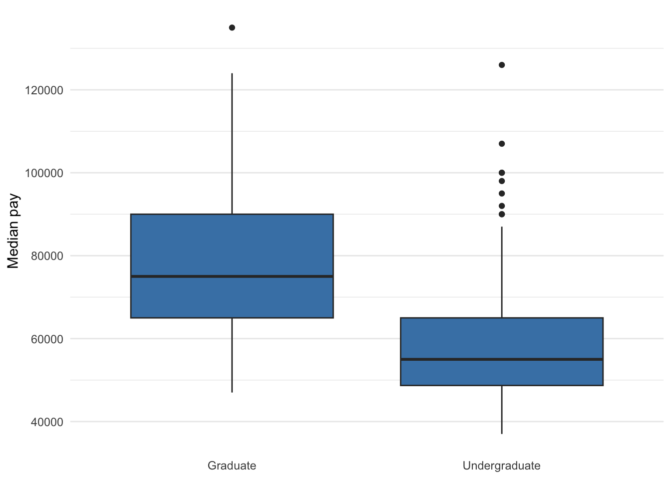
Figure 5.10: Median pay for undergraduate and graduate degrees of the same group of majors
Overlaying histograms for each level could work too as is done in Figure 5.11.
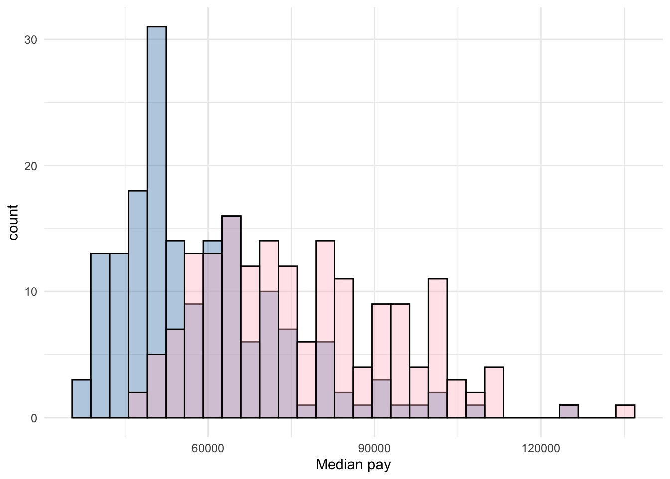
Figure 5.11: Median pay for undergraduate and graduate degrees of the same group of majors
5.4.2 Two numerical variables
5.4.2.1 Scatter plot
Scatter plots visualize the association between two numerical variables, preferably continuous or discrete with many values. It is also common to overlay a simple regression line for the two variables, thus providing a reader the full scatter of the two distributions as well as a tracing of how the two variables move in tandem, on average.
Suppose we wanted to visualize the relationship between median pay of graduate degrees and the total number of people with that graduate degree.
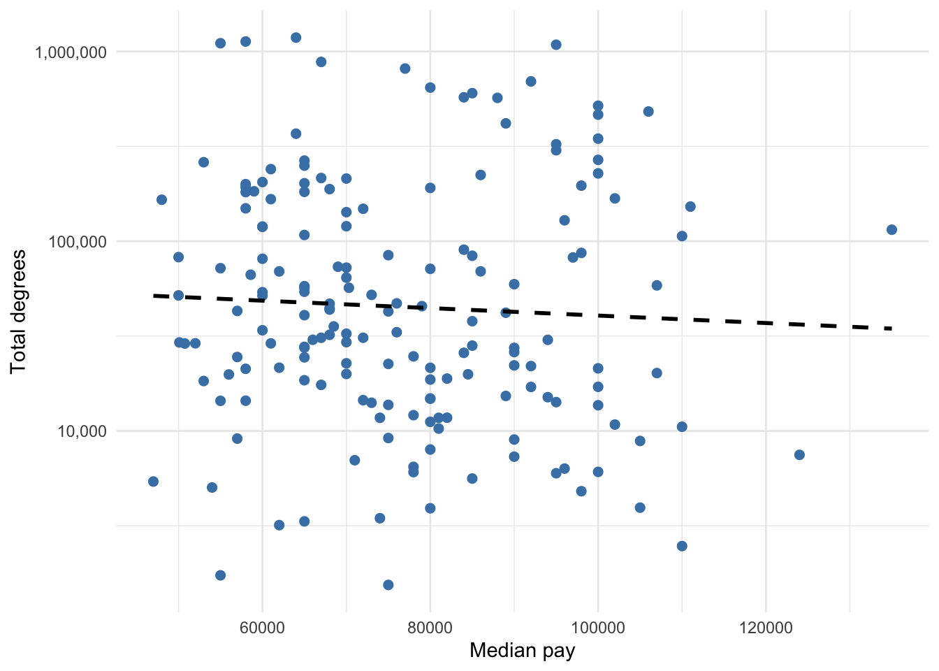
Figure 5.12: Graduate degree median pay and total number of people with degree
5.4.2.2 Line graph
If we want to visualize the association between a numerical variable and time (i.e. change over time), then a line graph is probably the most common choice, though a bar chart or dot plot can work too. The graduate degree data is cross-sectional, so there is no good way to make a line graph using these data. I trust you have seen a line graph before. We will cover how to make line graphs using panel data in Chapter 20.
The logic of visualization choice discussed in this chapter applies regardless of what particular software one uses. To learn how to generate most of these graphs in R, proceed to Chapter 20.