4 Descriptive Statistics
“Just the facts, ma’am.
—Joe Friday, Dragnet
4.1 Learning objectives
- Explain the difference between descriptive and inferential statistics
- Explain the difference between a population and sample; parameter and statistic
- Understand a distribution of a random variable
- Explain and apply the descriptive measures of center, spread, and association
- Choose the preferable measures of center and spread given a distribution and explain why
- Determine the direction and strength of association given a scatterplot or correlation coefficient
- Explain the possible shortcomings of correlation
4.2 Two goals of statistics
The application of statistics has one or both of the following goals:
- Descriptive statistics: summarizes the characteristics of observed data in a sample or population. This can involve describing the distribution of a variable or the association between two or more variables.
- Inferential statistics: uses the characteristics of observed data in a sample to make inferences about the characteristics of an unobserved population.
You can think of these two goals as levels. At the base is descriptive statistics. If we have data for one or more variables, any analysis will involve the description of those data. Description may be the end goal of an analysis in which case the next level – inferential statistics – is not pursued.
A key distinguishing feature between descriptive and inferential statistics is the manner in which they involve a population and/or sample.
- Population: all members of a specified group pertaining to a statistical question
- Sample: a subset of a population
Descriptive statistics provides information about an observed population or an observed sample of that population; whichever of the two our data includes. Inferential statistics uses data from an observed sample to make educated, scientific guesses about a population for which we do not have data. In many cases, we cannot study an entire population because of logistics or cost. Instead, we take a sample of that population to make inferences about it.
Consider the question, “What is the average GPA of all MPA students in the United States?” In this case, the population is all MPA students in the United States. It is unlikely I could obtain the GPA of every MPA student in order to calculate the average GPA. Therefore, I may take a sample of MPA students instead, calculate their average GPA, and use inferential statistics to make conclusions about the average GPA for the population of all MPA students in the United States.
Note that a sample is a subset of the population, meaning that it includes only members of the population. If this class had non-MPA students, and I used all students in the class as my sample, then I no longer have a sample of the intended population.
Our research question can be such that the population is accessible enough to collect data on all its members. If our question was instead, “What is the average GPA of students in this class?”, then the population is all of the students in this class. In this case, I could easily observe the GPA of all members of the population and compute the average GPA for the population.
We can describe a sample or a population as long as we have the data to do so. Inference uses a sample we observe with data to describe a population we do not.
When we compute statistical measures, such as an average, of a population or sample, those measures have specific names:
- Parameter: a measure pertaining to a population
- Statistic: a measure pertaining to a sample
Whether a statistical measure is a population parameter or sample statistic depends on whether my measure is computed using data from a population or a sample.
If the population is students in this class, and I compute the average GPA for all of the students in this class, that measure is a population parameter. If the population is all MPA students in the U.S., and I use the students in this class as a sample of the population, then the average GPA of the students in this class is a sample statistic.
In inference, a sample statistic is often referred to as an estimate because it serves as an estimate of the population parameter. If my goal is to use inferential statistics to estimate the average GPA of all MPA students in the US, the average GPA of MPA students in this class could be used as the estimate of the parameter. The parameter in this example would be the actual average GPA of all MPA students in the US; a value I do not directly compute.
4.3 Distributions
Descriptive statistics summarizes characteristics of variable distributions. Before reviewing the measures used to summarize distributions, we should understand what a distribution is.
A distribution tells us the (possible) values of a variable and the frequency at which those values occur.
The values of a variable are the result of some data-generating process we may or may not fully understand. This data-generating process determines the range of possible values a variable can take on and the frequency at which those values occur. These values and frequencies are revealed to us when we record multiple measures of a variable.
Sometimes we know all the possible values of a variable, or at least the range of possible values. We know a variable for assigned biological sex has possible values of male and female. We know a variable for GPA has a possible range of 0 to 4, in most cases.
Sometimes we know what the frequency of values for a variable should be. Genetics tells us to expect roughly 50% males and females. Other times we do not know the function that determines frequency, or it is too complex to fully understand. For example, we have some idea of the factors that influence GPAs, but there will always be some factors or randomness that goes unaccounted.
To make this as concrete as possible, let’s consider a variable of something that is simple and familiar to all of us: a roll of a six-sided die.
We know a roll of a six-sided die can take on a range of integers between 1 and 6. We also know the frequency of each value is the same at 1 in 6, or about 17%. Therefore, we know the distribution of this variable, which is depicted below in Figure 4.1.
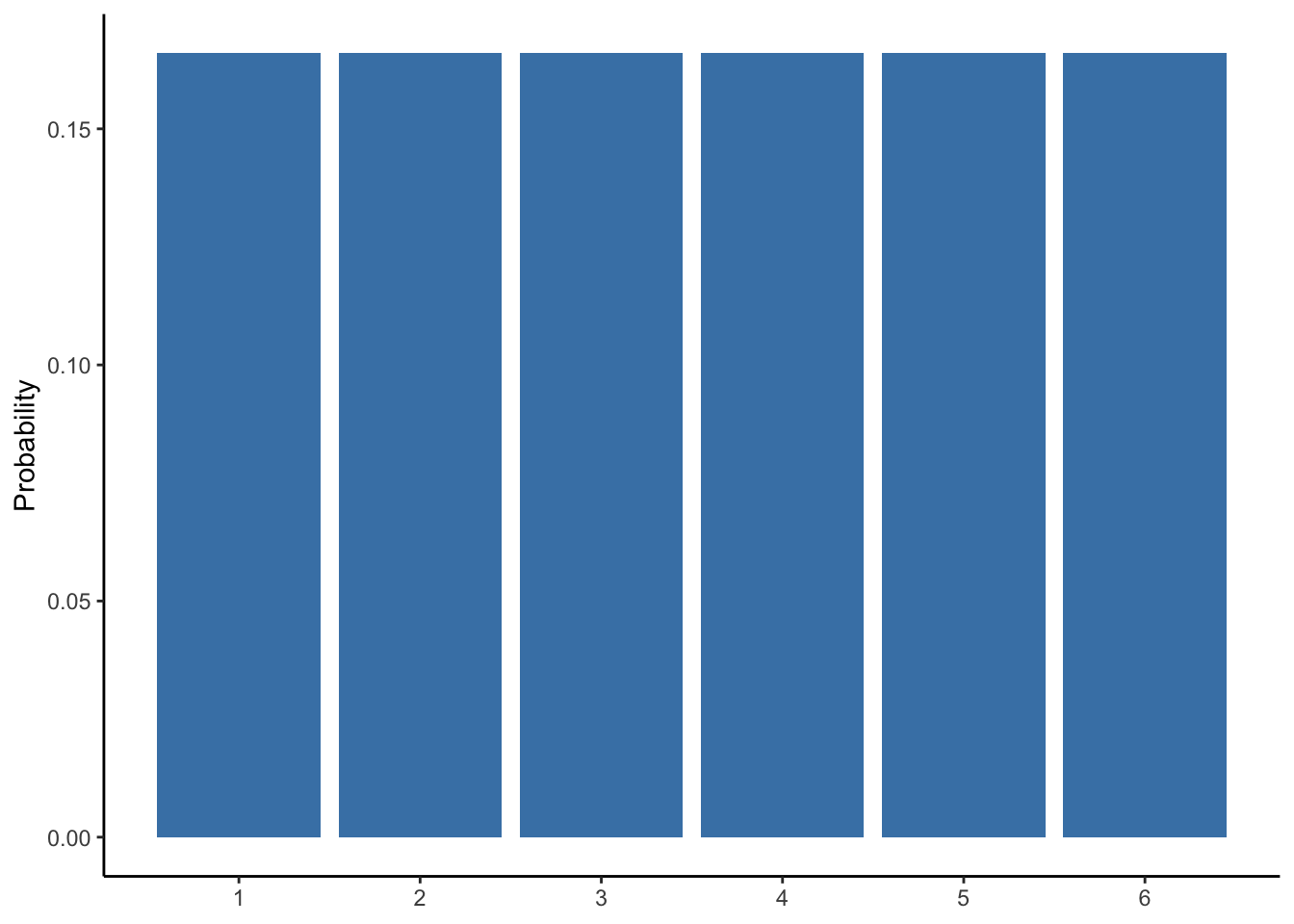
Figure 4.1: Probability distribution of a six-sided die
Therefore, if we were to roll the die six times, we would expect the following data in Table 4.1, though not necessarily in this order.
| roll | value |
|---|---|
| 1 | 1 |
| 2 | 2 |
| 3 | 3 |
| 4 | 4 |
| 5 | 5 |
| 6 | 6 |
And we could represent this distribution by counting the number of times each value occurred using a histogram as shown in Figure 4.2, which is the essentially the same as Figure 4.1.
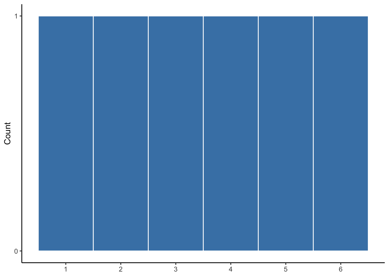
Figure 4.2: Expected distribution of 6 rolls
Of course, this is just what is expected to happen, on average, given many rolls of a die. Anyone who has played a board game knows streaks can occur. Given a number or rolls, we probably will not observe a uniform distribution of values.
Suppose we roll 12 times and record the value of each roll, as is shown in Table 4.2.
| roll | value |
|---|---|
| 1 | 5 |
| 2 | 2 |
| 3 | 4 |
| 4 | 2 |
| 5 | 5 |
| 6 | 1 |
| 7 | 1 |
| 8 | 4 |
| 9 | 3 |
| 10 | 2 |
| 11 | 5 |
| 12 | 1 |
We can visualize the distribution of these 12 rolls, as is done in Figure 4.3.
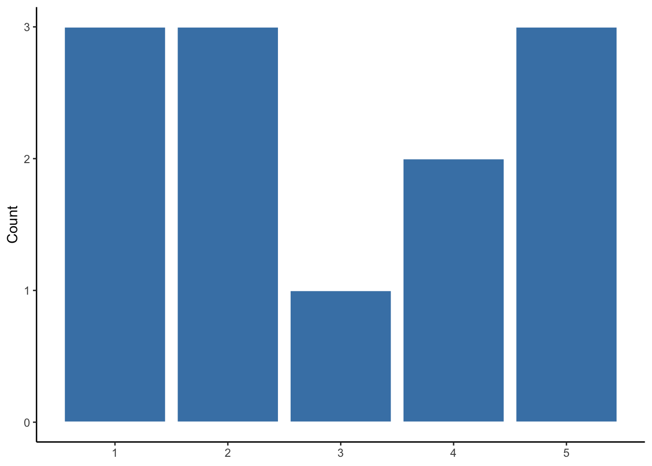
Figure 4.3: Observed distribution of 12 die rolls
Here we can see the randomness of the variable. Values 1, 2, and 5 occur more frequently than 3 and 4, and 6 does not occur at all. If we were to roll the die many more times, it would look more like the distribution we would expect. But for this sample of die rolls, the distribution is unique.
This is exactly the point of descriptive statistics: whether or not we know what to expect in terms of a variable’s distribution, we want to know the characteristics of the distribution for a variable from a particular sample or population. When we ask for, say, a variable’s average, we are asking for the approximate midpoint of that variable’s distribution.
Descriptive measures help us summarize characteristics of distributions and some serve as the building blocks for other descriptive measures as well as inferential statistics.
4.4 Descriptive Measures
A die roll is uninteresting and unimportant. In our review of descriptive measures, let us consider them with respect to the distribution of the infant mortality rate across 222 countries in 2012. Infant mortality is the number of deaths of infants under one year old per 1,000 live births.
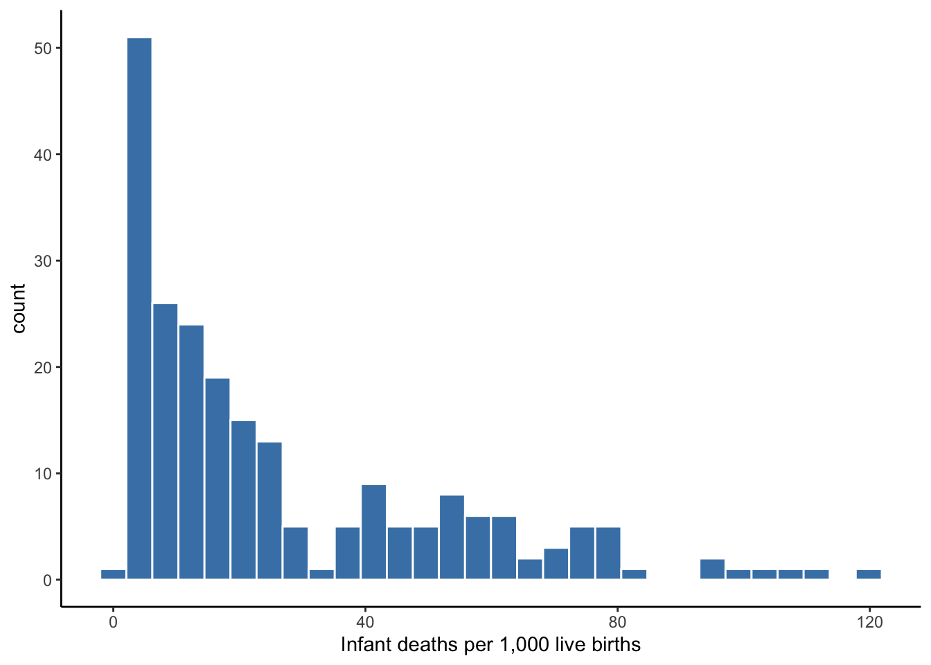
Figure 4.4: Infant Mortality Rates
We could simply show the entire distribution of values, but it is usually helpful to summarize key characteristics of it. We can describe distributions along three dimensions:
- Center: what is the typical value of this variable?
- Spread: how far away are values typically from the center?
- Association: what is the typical value or spread of the distribution given a value of another variable?
Multiple descriptive measures can answer the three questions above. Which measure is more appropriate to use largely depends on the shape of the distribution.
4.4.1 Measures of center
Again, measures of center are meant to convey the typical value of a distribution; the most representative value, or the value we would expect if we were to randomly draw one observation from the distribution.
Mean
The mean or average takes the values of a variable, adds them together, then divides that sum by the total count of values.
\[\begin{equation} {\displaystyle \bar{x}={\frac {1}{n}}\sum _{i=1}^{n}x_{i}={\frac {x_{1}+x_{2}+\cdots +x_{n}}{n}}} \tag{4.1} \end{equation}\]
Infant mortality has 222 values, so \(n\) in equation (4.1) above would equal 222 in this case. If we were to pluck one country out of our pool of 222 countries at random, the mean tells us the infant mortality rate to expect. In other words, the mean tells us the typical infant mortality rate in our observed data. In this case, the average infant mortality rate is 26.7 per 1,000 live births.
Median
If we took the 222 infant mortality rates and listed them in ascending or descending numerical order, the median is the value that sits at the middle of the ordered list. The median is also referred to as the 50th percentile because half of the values fall below it and half of the values fall above it. In the case of an even number of values, there is no naturally occurring middle value. In that case, we take the average of the two values in the middle. The median infant mortality rate is 15.6.
Mode
The mode is the value that occurs most frequently. If all values occur only once, then a variable has no mode. If two or more values occur an equal number of times and it is more than other values, then a variable has two or more modes. For instance, the modes for our 12 die rolls in Figure 4.3 are 1, 2, and 5. The mode for infant mortality rates is 11.6.
Choosing a center
As Figure 4.4 shows, three measures of center have provided us three different typical infant mortality rates. The mean is represented by the red line, the median by the purple line, and the mode by the green line.
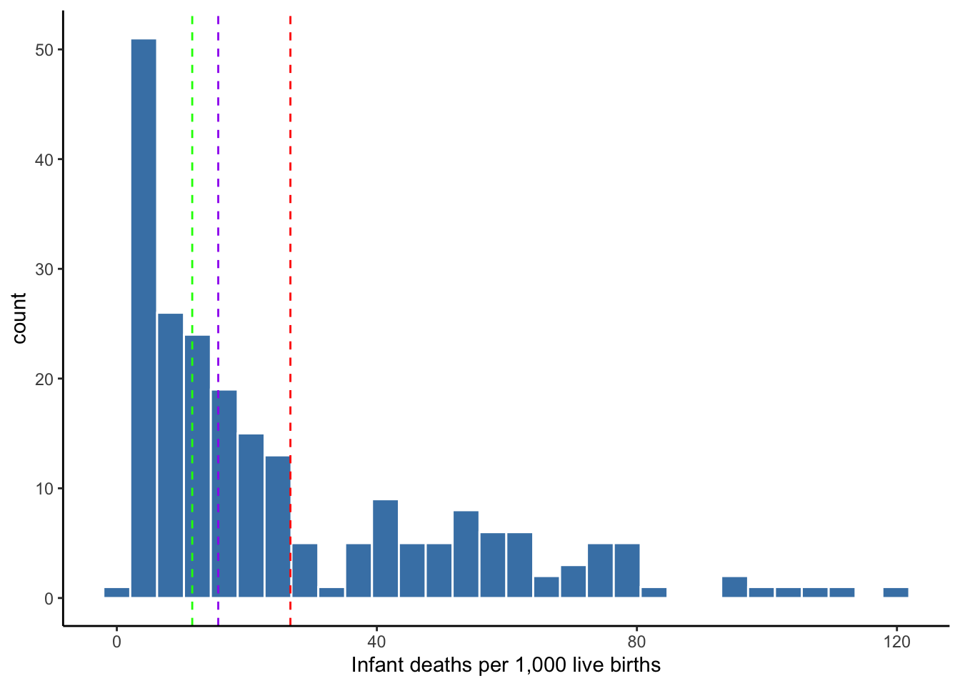
Figure 4.5: Centers of infant mortality rates
Which measure of center should we choose to report? We could report all three, but we may want to apply some professional judgment. Providing three numbers to convey the typical value of a variable may confuse our audience.
For continuous variables reported at several decimal places, a value may not occur more than once because of the precision. More importantly, because of this low probability of repeat values, the mode is not guaranteed to represent a typical value. If it only takes two occurrences to qualify as the mode, that second occurrence could be an extreme value.
The mode is rarely used to describe continuous variables. Instead, the mode is commonly used to report the most frequent value of categorical or discrete variables with relatively few possible values, such as race, sex, political party.
When choosing between mean and median, the better choice depends on the presence of extreme values or the extent to which a distribution is skewed. Skew pertains to the tails of a distribution–the taper to the left and right of its center. If the right or left tail extends far out from the center, we consider the distribution to be right- or left-skewed. Our distribution of infant mortality rates is right-skewed.
When a distribution is skewed, the median is generally a better choice for reporting its center than the mean. This is because the mean is sensitive to extreme values.
Note in Figure 4.5 that the mean is pulled to the right by the right-skew of extreme values. The red line representing the mean is to the right of the cluster of frequent values and may not be a good answer for the typical value of this distribution. The median is not sensitive to extreme values. No matter how far the values above the median were to stretch to the right, the median of the distribution would not change.
4.4.2 Measures of spread
Measures of center convey the typical value of a distribution. The typical infant mortality rate is 26.7 or 15.6 depending on whether we choose to use mean or median, respectively. If we only had this measure, we would have no idea how far away the values are from the center. Are the infant mortality rates of most countries close to this center, or is the typical value not representative of most countries’ infant mortality rates? Measures of spread provide us this information.
Measures of spread convey how much values typically deviate from the typical value (i.e., center), or how different observations are from each other with respect to the variable being described.
Variance
Almost all values of a numerical variable, especially a continuous variable, do not equal the mean. The difference between a particular value and the mean of the variable is often referred to as deviation from the mean. The variance squares each observation’s deviation from the mean, sums all the deviations, and divides this sum by the total count of observations minus one. Equation (4.2) displays this process using mathematical notation.
\[\begin{equation} {\displaystyle S^2={\frac {1}{n-1}}\sum _{i=1}^{n}(x_{i}-\bar{x})^2={\frac {(x_{1}-\bar{x})^2+(x_{2}-\bar{x})^2+\cdots +(x_{n}-\bar{x})^2}{n-1}}} \tag{4.2} \end{equation}\]
The mean infant mortality rate is 26.7. If we subtract this mean from each country’s rate, we have each country’s deviation from the mean, some of which is shown in Table 4.3. Then, we square these deviations as is also shown in the table. We then sum the 222 squared deviations and divide by 221. The variance for our infant mortality rates is 672.6.
| country | inf_mort_rate | deviate | sq_deviate |
|---|---|---|---|
| Afghanistan | 122 | 95 | 9012 |
| Niger | 110 | 83 | 6936 |
| Mali | 109 | 82 | 6786 |
| Somalia | 104 | 77 | 5932 |
| Central African Republic | 97 | 70 | 4966 |
Variance is an important building block for inference, but it is useless to report as a descriptive measure because it is in squared units. If someone asks how far values are spread out from the mean, it makes no sense to report that values deviate from the mean by 672 squared infant deaths.
Standard deviation
The standard deviation is simply the square root of variance, which returns our units to their original meaning.
\[\begin{equation} {\displaystyle s = \sqrt{S^2}} \tag{4.3} \end{equation}\]
The standard deviation in the infant mortality rates data is 25.9. This tells us that, on average, infant mortality rates are about 26 deaths above and below the mean.
The standard deviation is the average deviation from the mean.
Interquartile range
Recall that the median is the 50th percentile of a distribution–half of the values fall below the median and half fall above it. Two additional percentiles sometimes reported are the 75th and 25th percentiles. The 75th percentile is the value at which 75% of values fall below and 25% fall above it, while the 25th percentile is the value at which 25% of values fall below and 75% fall above it. All percentiles – from the 0th percentile (i.e., minimum) to the 100th percentile (i.e., maximum) – are interpreted this way.
The interquartile range (IQR) is equal to the 75th percentile minus the 25th percentile. It provides the middle 50% of the values in a distribution.
The IQR for infant mortality rates is 35.6. Alternatively, the IQR can be reported by specifying the 75th and 25th percentiles, leaving the reader to compute the difference between the two. The 75th percentile for infant mortality rates is 42.1, and the 25th percentile is 6.5.
Range
The range is the maximum value in a distribution minus the minimum value of a distribution. It conveys how different are the most different observations with respect to the variable being described.
Usually, the range is left implied in a table of summary statistics by reporting the maximum and minimum without differencing the two. This allows the reader to know the most extreme values in a distribution.
The minimum of infant mortality rates is 1.8, and the maximum is 121.63. Therefore, the range of the distribution is 119.8.
In the case of infant mortality rates, we know the minimum possible value is 0 by definition, but the minimum value in our distribution is 1.8. Perhaps 0 deaths is impossible for any country to achieve. Moreover, the maximum value is 121.63. This range tells us the most different countries are very different.
Choosing a measure of spread
The same logic applies to choosing a measure of spread as choosing a measure of center. The standard deviation is based on the mean, and so it is also sensitive to extreme values that, if present, could exaggerate the typical spread of the distribution. The IQR is based on percentiles just like the median. Therefore, IQR is not sensitive to extreme values.
Figure 4.6 displays the mean and plus-and-minus one standard deviation using red dashed and solid lines, respectively. The median and the IQR (25th and 75th percentiles) are represented by the purple dashed and solid lines, respectively. Note how wide the area contained by the standard deviation is–it contains most of the distribution and the lower bound of 0.7 is lower than the minimum observed value of 1.8.
In this case, standard deviation is not preferable for conveying the typical deviation from the center, as it contains plenty of values that are rather atypical deviations from the center (a center that is also flawed by using the mean). For describing the distribution of infant mortality rates, the median and IQR are better choices.
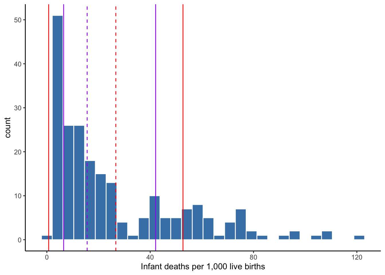
Figure 4.6: Center and spread of infant mortality rates
4.4.3 Outliers
Outliers refer to extreme values, the inclusion of which may lead to worse conclusions than if they were excluded from a statistical analysis.
An outlier could be due to data entry error. In the case of error, the value should be corrected, if possible, or removed from the data. If not an error in the data, it is important to recognize that an outlier is a real occurrence. The removal of real data should be done only after careful consideration of the consequences and should always be reported. Outliers should not necessarily be excluded from an analysis. It depends on the context. We may only care about making conclusions for typical cases. If so, removing outliers may be warranted. However, atypical cases may be an important part of the story. The Great Depression and Recession involved atypical stock market crashes, but you would not want them excluded from a description of annual stock market returns.
There is no single definition of an outlier, but the most common definition uses \(1.5 \times IQR\). Values that are more than \(1.5 \times IQR\) below the 25th percentile are outliers on the left side of the distribution. Values that are more than \(1.5 \times IQR\) above the 75th percentile are outliers on the right side of the distribution.
Recall that the IQR of infant mortality rates depicted in Figure 4.6 was 35.6 with 25th and 75th percentiles of 6.5 and 42.1, respectively. Applying the common definition of an outlier, we get:
\[1.5 \times 35.6 = 53.5\]
Subtracting this value from the 25th percentile of 6.5 gives us a lower-bound for identifying outliers.
\[6.5-53.4=-46.9\]
Therefore, values that fall below -46.9 are outliers, but this is impossible given our variable is infant mortality rates.
Adding this value to the 75th percentile of 42.1 gives us a upper-bound for identifying outliers.
\[42.1+53.4=95.5\]
Therefore, values above 95.5 could be considered outliers on the right end of the distribution. Figure 4.6 indicates there are a few outliers in our data based on this definition.
4.4.4 The normal distribution
As a brief aside, it should be mentioned that if a distribution is normal, then measures of center and spread will be similar to each other. This is one of several desirable features of the normal distribution.
Figure 4.7 shows a simulated scenario in which the infant mortality rates in our 222 countries exhibit an approximately normal distribution. Note the peak near the center of the distribution and the symmetry of the spread. There is no notable skew.
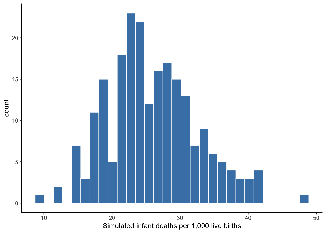
Figure 4.7: Simulated normal distribution of infant mortality rates
Table 4.4 confirms the similarity between measures of center and spread for this simulated distribution. This is one reason it is important to visualize your distribution. If it appears approximately normal, then you should report the mean and standard deviation (along with minimum and maximum values), as the are more widely understood.
| Mean | Median | Mode | SD | IQR |
|---|---|---|---|---|
| 26 | 25.5 | 22.1 | 6.6 | 8.4 |
Again, the normal distribution has several desirable features that will be discussed further in the chapters pertaining to inference. One is that if a distribution is approximately normal, then extreme values are not a concern and the mean and standard deviation are good measures of center and spread, respectively. Besides making our choice of measures convenient, why is this worth repeating? Because the mean and standard deviation are building blocks to the next category of descriptive measures: association. If mean and standard deviation are bad choices of center and spread, then our measures of association will be adversely affected.
4.4.5 Measures of association
With association, we now consider the distributions of two variables at a time. That is, given the value within one variable’s distribution, what does the distribution of another variable look like?
We need a second variable to continue our example involving infant mortality rates. Table 4.5 shows a preview of a dataset that adds two more variables to our previous infant mortality data.
| country | inf_mort_rate | lifeExp | gdpPercap |
|---|---|---|---|
| Afghanistan | 121.63 | 43.828 | 974.5803 |
| Niger | 109.98 | 56.867 | 619.6769 |
| Mali | 109.08 | 54.467 | 1042.5816 |
| Somalia | 103.72 | 48.159 | 926.1411 |
| Central African Republic | 97.17 | 44.741 | 706.0165 |
Recalling that the mean infant mortality rate is about 26, the five countries included are in the right tail of the distribution. Also, you probably know enough about life expectancy to know that the values for these countries are quite low. Perhaps these two variables are associated?
In fact, we know they are associated. Life expectancy in a given year is the average age at which people in that country died. If a country has a high frequency of infants dying, then that will pull the mean downward. A common misunderstanding of life expectancy is that people in that country tend to die at the age of the country’s life expectancy. This is certainly not the case if a country has a high infant mortality rate. While adults in countries with low life expectancy may die younger, adults tend to live longer than the average life expectancy suggests. The key is making it out of infancy alive.
Visual association
As was the case with one variable, we want to visualize the distributions of two variables. When working with two continuous variables, the scatter plot is the most common choice to visualize association between two variables. Figure 4.8 plots the paired values of infant mortality rate and life expectancy for each country.
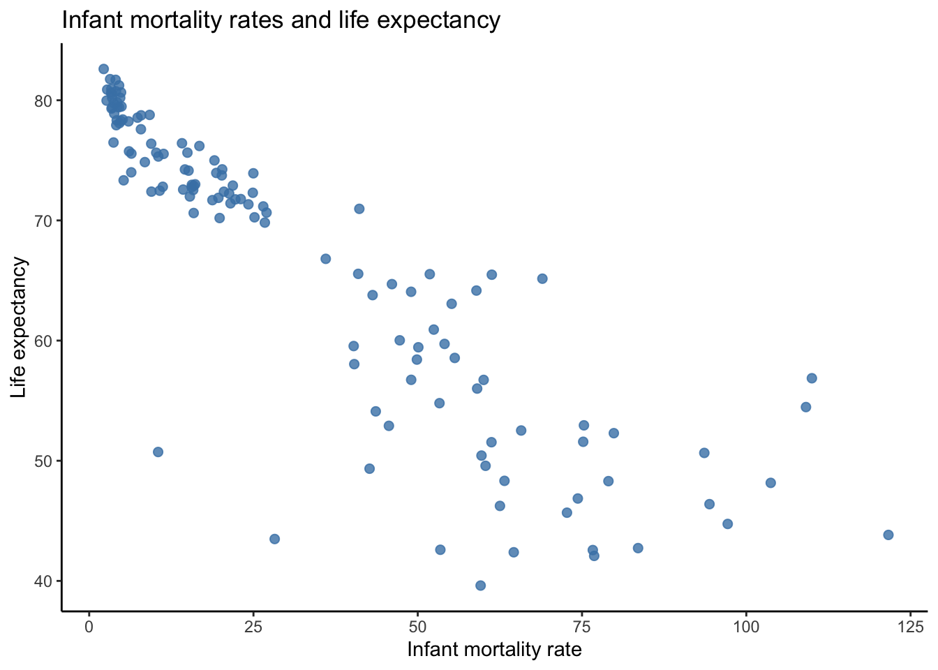
Figure 4.8: Visualizing association between two continuous variables
Note that I plotted infant mortality rate along the x axis and life expectancy on the y axis. This choice was deliberate. If we suspect that one variable influences or affects the value of another variable, then the variable doing the influencing should be plotted on the x axis. Plotting a variable on the y axis implies to the viewer that it responds to the variable on the x axis.
Figure 4.8 confirms our suspicion that the two variables are associated. There appears to be a rather strong association such that as infant mortality rate increases, the lower a country’s life expectancy.
Quantified association
As was the case with one variable, we want to describe the association between two variables using quantitative measures. The association between two or more variables can be described in terms of
- Direction: when one variable increases, does the other variable increase or decrease?
- Strength: the extent to which one variable responds proportionally to another.
- Magnitude: given a specific increase or decrease in one variable, by how much does the other variable increase or decrease?
There are several measures one can use to answer the above question.
- Covariance: measures direction of association between between two variables
- Correlation coefficient: measures direction and strength of association between two variables
- Regression coefficient: measures the direction and magnitude of association between an explanatory variable and an outcome variable
- Coefficient of determination ( \(R^2\) ): measures the strength of association between a set of one or more explanatory variables and an outcome variable
The regression coefficient will be the focus for much of the remainder of this text beginning with Chapter 6. Covariance and the correlation coefficient are briefly considered below.
Covariance
Covariance tells us when one variable, \(X\), is above or below its mean, whether another variable, \(Y\), tends to be above or below its mean. If \(Y\) tends to be above (below) its mean when \(X\) is above (below) its mean, then the two have a positive covariance and are positively associated. If \(Y\) tends to be below (above) its mean when \(X\) is above (below) its mean, then the two have a negative covariance and are negatively associated. If the two variables exhibit no tendencies, they have a covariance of 0 and thus no association.
Figure 4.9 adds references lines for the mean of each variable. Note that when infant mortality is above its mean (to the right of the red line), life expectancy is below its mean (below the purple line) in almost all cases. When infant mortality is below its mean, life expectancy is above its mean in almost all cases. Therefore, these two variables have a negative covariance and are negatively associated. In fact, the covariance between infant mortality rate and life expectancy is -312.7
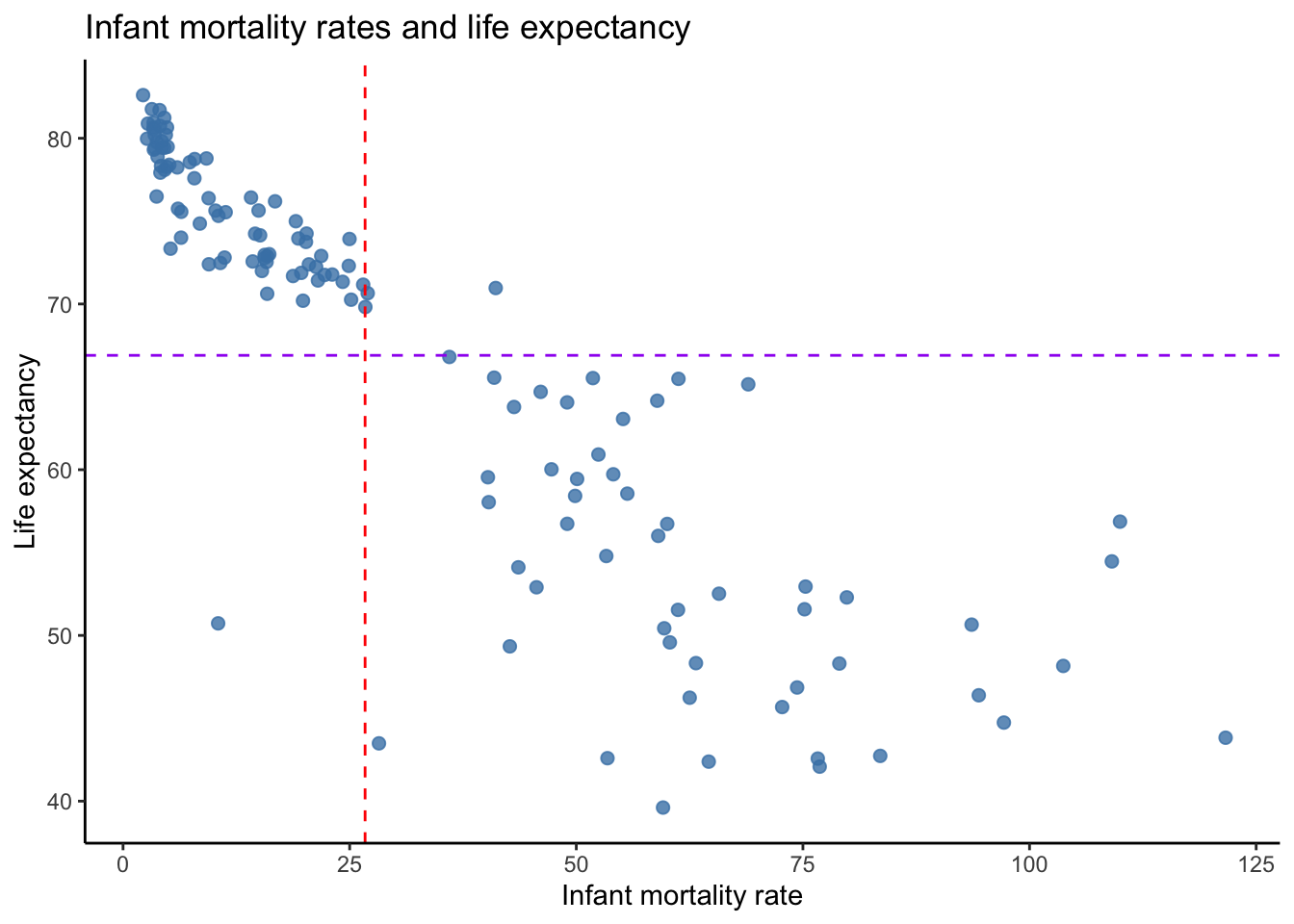
Figure 4.9: Visualizing covariance
Covariance is the association analog of variance. It is an important building block of other measures of association, but it is essentially useless for description because it only tells us the direction of association. The correlation coefficient tells us the direction and strength of association. Therefore, covariance is never used for description because correlation provides us twice as much information.
Correlation
If \(Y\) tends to increase (decrease) as \(X\) increases (decreases), then the two are positively correlated. That is, the two variables tend to move in the same direction. If \(Y\) tends to increase (decrease) as \(X\) decreases (increases), then the two are negatively correlated. That is, the two variables tend to move in opposite directions. Correlation tells us how much the paired values of two variables in a scatterplot exhibit a straight line and whether that straight line is positively or negatively sloped.
The correlation coefficient ranges between -1 and 1. If it is negative, then the two variables are negatively associated. If it is positive, the two variables are positively associated. The closer the correlation coefficient of two variables is to -1 or 1, the stronger their correlation and the more the two variables exhibit a straight line in a scatterplot. A correlation equal to -1 or 1 indicates the two variables form a perfect straight line. If two variables exhibit no shared tendencies and form what appears to be a random scattering of plot points, than their correlation will be close or equal to 0.
Based on the covariance and Figure 4.9, we know to expect a negative correlation between infant mortality rate and life expectancy. We also know the correlation will not be -1 because the points do not form a perfect straight line. Nevertheless, they do form a fairly tight downward path, so we should expect a correlation closer to -1 than 0. It turns out that the correlation is equal to -0.9. Infant mortality rate and life expectancy exhibit a strong, negative association. As infant mortality increases, life expectancy decreases.
If we imagined drawing a line through the data points on our scatterplot from left to right that could freely curve according to however the data are scattered, would that line be a straight line and would it slope upward or downward? Figure 4.10 does exactly that with our data. Note that the data points lead the line to slope downward almost throughout the range of observed values. In the upper-left quadrant, the data points are tightly clustered around the line, indicating a strong correlation. In the bottom-right quadrant, the data points begin to spread further away from the line, indicating a weaker correlation. The line also begins to turn in the positive direction, which lowers the correlation coefficient.
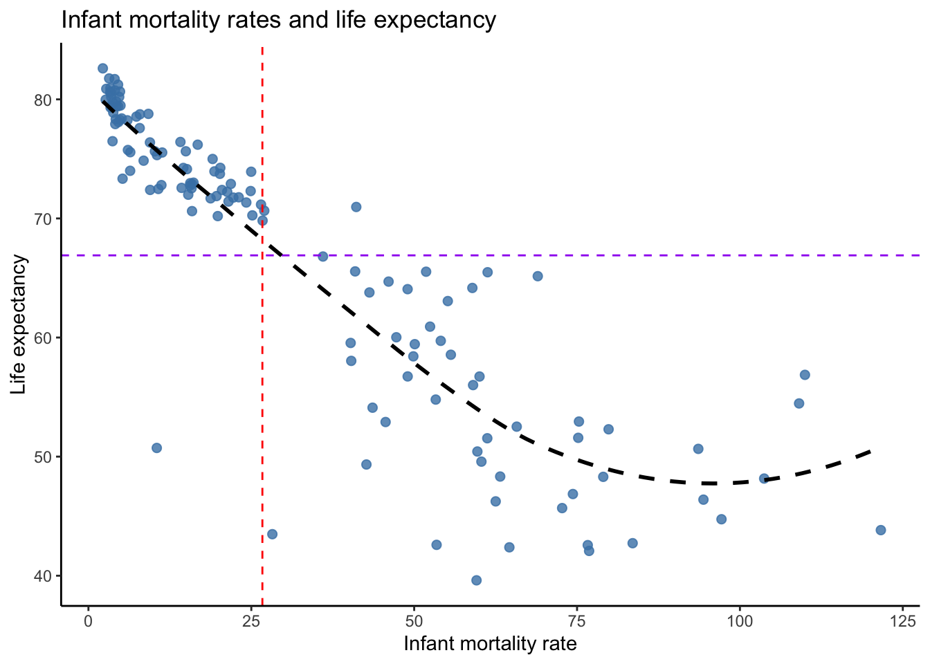
Figure 4.10: Drawing a free line through the data
The correlation coefficient has three qualities that can lead to misunderstandings or mistakes. First, correlation is sensitive to extreme values. A few points on a scatterplot can impose undue influence on the line that is drawn through the data, causing the correlation coefficient to increase or decrease dramatically. Second, correlation measures only the linear association. If two variables formed a perfect U-shape in a scatterplot, they are strongly associated. However, their correlation coefficient would suggest a weaker relationship because a straight line does not fit a U-shape well. Third, correlation is a necessary but not sufficient condition for causality. In order to validly claim that a change in the value of one variable causes the values of another variable to change, they must be correlated, but a few more conditions must also be met. Those conditions are discussed in Chapter 9.
4.5 Categorical Variables
Categorical variables, especially nominal variables, do not have a continuous distribution to calculate descriptive measures of center and spread. Figure 4.11 below visualizes the race of 800 pregnant women coded as two levels: white or not white. Note that it would not make sense to calculate a mean or median for this variable (technically, a two-level variable can be coded as 0 or 1, then the mean equals the proportion of observations labeled as 1). Mode is a sensible choice in this case, but it does not convey much information. If we had a variable with more levels, such as a 5-point Likert scale within a satisfaction survey, it may be of more interest to know which response was the most frequent.
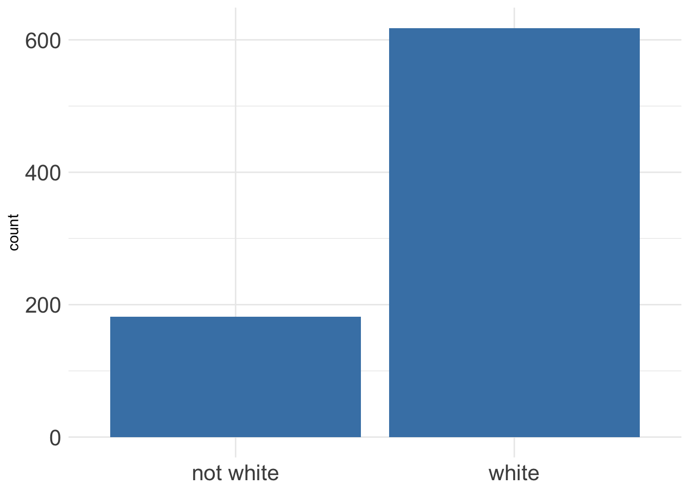
Figure 4.11: Race of a sample of pregnant women in North Carolina
The information in Figure 4.11 can be presented in a table like the one below.
| Race | Count |
|---|---|
| not white | 182 |
| white | 618 |
We usually want to provide the frequency of the different levels in terms of proportion or percentage like in the table below, which is commonly referred to as a frequency table. Here, we see that 77% of the pregnant women in this sample are white.
| Race | Proportion |
|---|---|
| not white | 0.23 |
| white | 0.77 |
To convey a possible association between two categorical variables without using a visualization, we can use a contingency table. Below is a contingency table for whether a mother in this sample was smoker and whether they had a premature birth.
| full term | premie | Sum | |
|---|---|---|---|
| nonsmoker | 625 | 91 | 716 |
| smoker | 69 | 15 | 84 |
| Sum | 694 | 106 | 800 |
This is a simple example where we have a variable, smoking, we may suspect to be the cause of another variable, premature birth. In such cases, we should place the cause (smoking) along the rows and the outcome (premature birth) along the columns. Then, we should provide the reader the frequency of the outcome, given each value of the cause. In the table above, the reader can do this by taking each value in one row and dividing by the total in the row. For example, among non-smokers, 87% carried full-term (625/(625+91)) and 13% had a premature birth. Alternatively, we could provide these frequencies directly in a table like below.
| full term | premie | |
|---|---|---|
| nonsmoker | 0.87 | 0.13 |
| smoker | 0.82 | 0.18 |
Now we can see that pregnant women in this sample who smoked had a higher frequency of premature births, 18% as opposed to 13% among non-smokers. Should we conclude that smoking causes an increase in the likelihood of premature birth? Not yet! Remember, correlation is not causation. So far, we have merely described an association between two variables. Broader conclusions like smoking causing an outcome requires inference. The most we can conclude from the above contingency table is that pregnant women in this sample who smoked had a higher proportion of premature births than the women in this sample who did not smoke.
To learn how to quickly compute descriptive statistics and produce professional-looking tables, proceed to Chapter 19.