8 Nonlinear Variables
“The shortest distance between two points is often unbearable.”
—Charles Bukowski
So far, we have repeatedly drawn straight lines through points. But, we know not all relationships are linear. Our income tends to rise and fall with age. Those in charge of the purchasing or production of something should know that average and marginal costs fall and then rise with quantity. Happiness tends to rise sharply with income but then plateaus at around $70,000 per year. If our goal is to draw the line that fits data best, why draw a straight line through data that is evidently nonlinear?
In this chapter, we will cover two ways to incorporate nonlinear relationships:
- Include a quadratic
- Include a logarithmic transformation
8.1 Learning objectives
- Explain why and how to extend a regression model to include a quadratic relationship
- Interpret the coefficients associated with a quadratic term in a regression model
- Compute the value of the quadratic explanatory variable at which the outcome is at its maximum or minimum
- Explain the difference between percent change and percentage point change
- Explain why to log-transform variables in a regression model
- Interpret results from log-log, log-level, and level-log models
8.2 Quadratic
If we theorize or see visual evidence that the association between an explanatory variable and an outcome is such that the outcome initially increases or decreases as the explanatory variable increases, then, at some value of the explanatory variable, the outcome decreases, then we may want to include a quadratic term of that explanatory variable in our regression model. That long-winded statement warrants an immediate visualization provided by Figure 8.1 below.
Note that wage appears to initially increase with age, then decreases. The data present a pattern that resembles an inverted U, also known as a concave parabola. Age and wage is a classic example of a quadratic relationship. We should not force ourselves to fit a straight line to these data; we can estimate a better line.
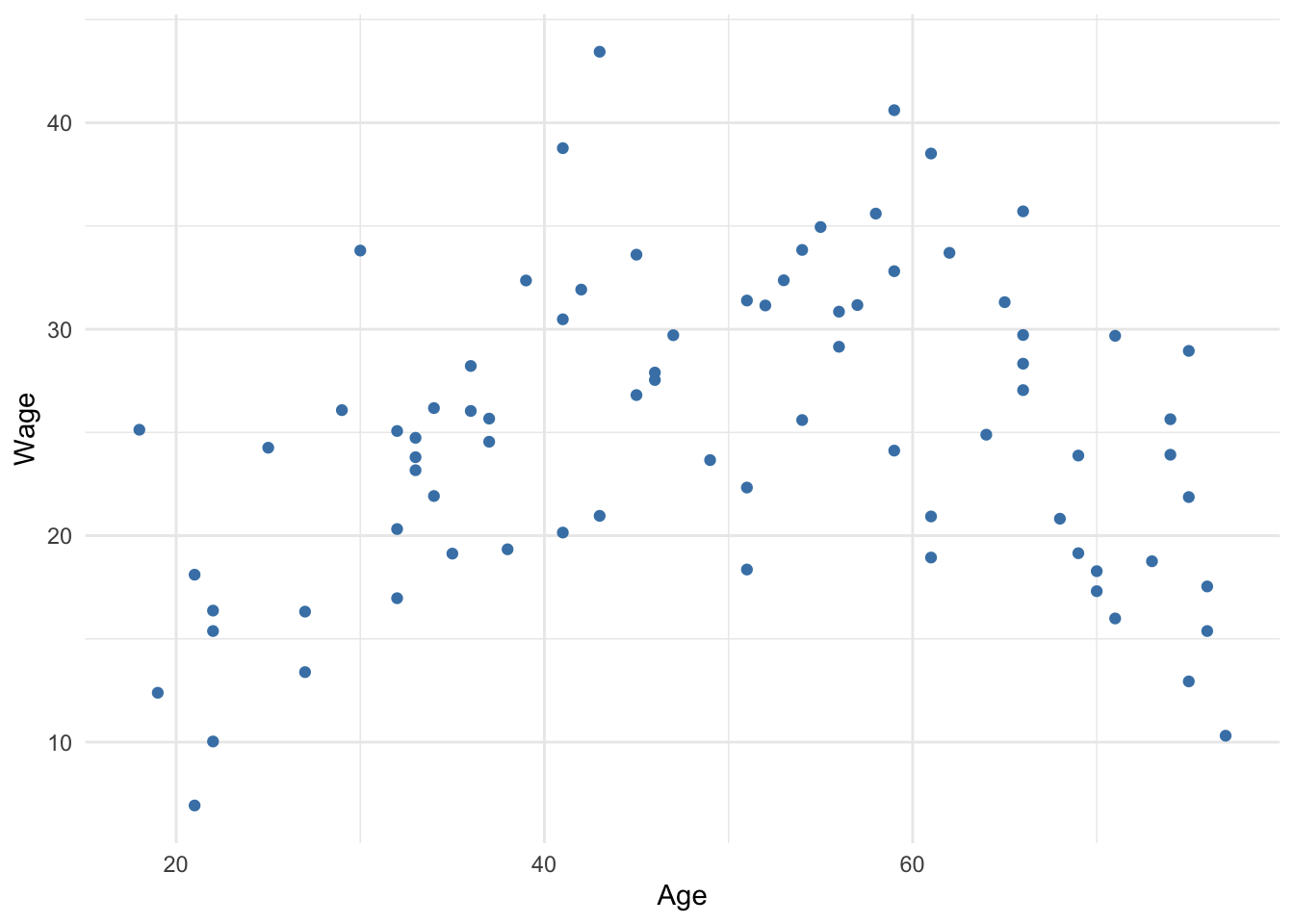
Figure 8.1: Wages by age
Equation (8.1) presents a generic population regression model with a quadratic term (\(x_1\) and \(x_1^2\)). The only difference between this and previous models is the choice to square one of the explanatory variables. This is just an example. Any number of explanatory variables can be squared if theory warrants it.
\[\begin{equation} y = \beta_0 + \beta_1x_1 + \beta_2x_1^2 + \beta_3x_2 + \cdots + \beta_kx_k + \epsilon \tag{8.1} \end{equation}\]
Thus, the sample equation is as follows
\[\begin{equation} \hat{y} = b_0 + b_1x_1 + b_2x_1^2 + b_3x_2 + \cdots + b_kx_k \tag{8.2} \end{equation}\]
As we have done before, once we obtain estimates for the coefficients that correspond to \(x_1\) – \(b_1\) and \(b_2\), we want to be able to report how much \(y\) is predicted to change due to a one-unit change in \(x_1\). In order to report the marginal effect of an explanatory variable that has been squared, we use Equation (8.3) below. The result of this equation provides the predicted change in \(y\) given a one-unit change in \(x_1\).
\[\begin{equation} b_1 + 2b_2x_1 \tag{8.3} \end{equation}\]
Note that had we not squared \(x_1\) the predicted change in \(y\) from a one-unit change in \(x_1\) would be \(b_1\), which is exactly the same as in previous models.
However, now that we are estimating a curved line, the effect of a one-unit change in \(x\) on \(y\) is not constant; it changes depending on the value of \(x\).
Another important question when a quadratic relationship is involved is at what value of \(x\) is \(y\) maximized or minimized. This can help decision-making, such as how to minimize costs or maximize profit, or maximize the probability of some desirable outcome. In order to report the value of \(x\) at which \(y\) reaches its maximum or minimum, we use Equation (8.4) below. The result of the equation gives us the optimal value of \(x\).
\[\begin{equation} x = {\frac{-b_1}{2b_2}} \tag{8.4} \end{equation}\]
8.2.1 Using quadratics
Suppose we collect individual-level data for hourly wage, years of education, and age.
| Wage | Educ | Age |
|---|---|---|
| 19.13 | 9 | 35 |
| 25.67 | 12 | 37 |
| 38.77 | 21 | 41 |
| 32.37 | 17 | 53 |
| 19.34 | 6 | 38 |
| 18.76 | 18 | 73 |
| 18.11 | 14 | 21 |
Using these data, suppose we decide to estimate the following regression model:
\[\begin{equation} Wage = \beta_0 + \beta_1Age + \beta_2Age^2 + \beta_3Educ + \epsilon \tag{8.5} \end{equation}\]
Note that our regression model conveys some theory about the effect of age and education on wage. We are theorizing that age has a quadratic effect on wage. That is, the effect of age is not constant with each one-unit increase in age, and at some point, the effect of age switches sign (i.e., positive to negative or vice versa). Conversely, this regression model suggests the effect of education has a constant effect. Each one-unit increase has the same effect on wage regardless of whether education increases from 4 to 5, or 12 to 13.
Running this regression generates the following results
| term | estimate | std_error | statistic | p_value | lower_ci | upper_ci |
|---|---|---|---|---|---|---|
| intercept | -22.722 | 3.023 | -7.517 | 0 | -28.742 | -16.701 |
| Age | 1.350 | 0.134 | 10.077 | 0 | 1.083 | 1.617 |
| I(Age^2) | -0.013 | 0.001 | -9.840 | 0 | -0.016 | -0.011 |
| Educ | 1.254 | 0.090 | 13.990 | 0 | 1.075 | 1.432 |
In Table 8.2, note that there are two rows for Age–one for the linear, or level, term and a second for the quadratic term. When the quadratic relationship is an inverted U, or concave, the linear term will be positive and the quadratic will be negative. This corresponds with an initial positive relationship that eventually turns negative once the negative quadratic term overcomes the positive linear term.
Plugging our results from Table 8.2 into the regression equation, we obtain the following equation
\[\begin{equation} \hat{Wage} = -22.7 + 1.4\times Age - 0.01\times Age^2 + 1.3\times Educ \tag{8.6} \end{equation}\]
We can answer questions regarding the predicted value of Wage the same way as before. For example, the predicted wage of an individual who is 40 years old with 16 years of education is
[1] 38.1dollars per hour.
To predict the change in wage given a change in age, we need to know the beginning point for age. For example, if we were asked what is the predicted change in wage for a 24-year old one year later controlling for education, we plug this scenario into Equation (8.3) like so
\[(1 \times 1.35) + (1 \times 2 \times -0.013 \times 24)\]
The \(1\)s in the above equation are to make explicit that we are estimating the effect of a one-unit increase in age. The \(1.35\) is the linear effect of age on wage from Table 8.2. The \(-0.013\) is the quadratic effect of age on wage. Note the linear effect is positive, while the quadratic effect is negative. Solving this equation,
\[1.35 - 0.624 = 0.726\]
provides us the answer of a predicted increase of about $0.73 in hourly wage.
What about the predicted increase in wage given a one-unit increase in age for a person who is 64 years old, controlling for education? To solve, we use the same equation but replace 24 with 64.
\[1.35 + (2 \times -0.013 \times 64)\]
\[1.35 - 1.664 = -0.314\]
The predicted change is a \(decrease\) of about 31 cents in hourly wage. Note that at a high enough age, the negative quadratic effect overpowers the positive linear effect, resulting in a negative overall change.
Controlling for education, at what age do wages tend to reach their maximum? To answer, we plug the results into (8.4) like so
\[\frac{-1.35}{2 \times -0.013} = 51.92\]
This tells us that, on average, wages tend to reach a maximum at age 52, controlling for education. This aligns with our results for the effect of age between a 24-year old and 64-year old. The 24-year old is on the left side of the maximum and wage is increasing with each additional year. The 64-year old is past the maximum and wage is decreasing with each additional year. If we were to examine the marginal effect of age for someone 52 years of age:
\[1.35 + 2 \times -0.013 \times 52\]
\[1.35 - 1.352\]
The positive linear and negative quadratic effects offset (not exactly because the precise maximum is 51.923). In other words, the slope of the regression line between wage and age is 0 at age 52.
8.3 Log models
Once again, we will forego the math of logarithms and instead focus on why we may want to use them in a regression model and how to interpret the results. In short, logarithms are used to express rates of change in a variable (i.e. percent change) rather than absolute change in a variable (i.e. unit change).
8.3.1 Logarithmic scales
Graphs like Figure 8.2 below were commonplace during the spread of COVID-19. Note how the values on the y axis are evenly dispersed, but each tick mark increases by a factor of 10 (i.e. the previous value multiplied by 10). The y-axis is in a log10 scale. Another common log scale for visualization is a log2 scale which increases each interval by a factor of 2.
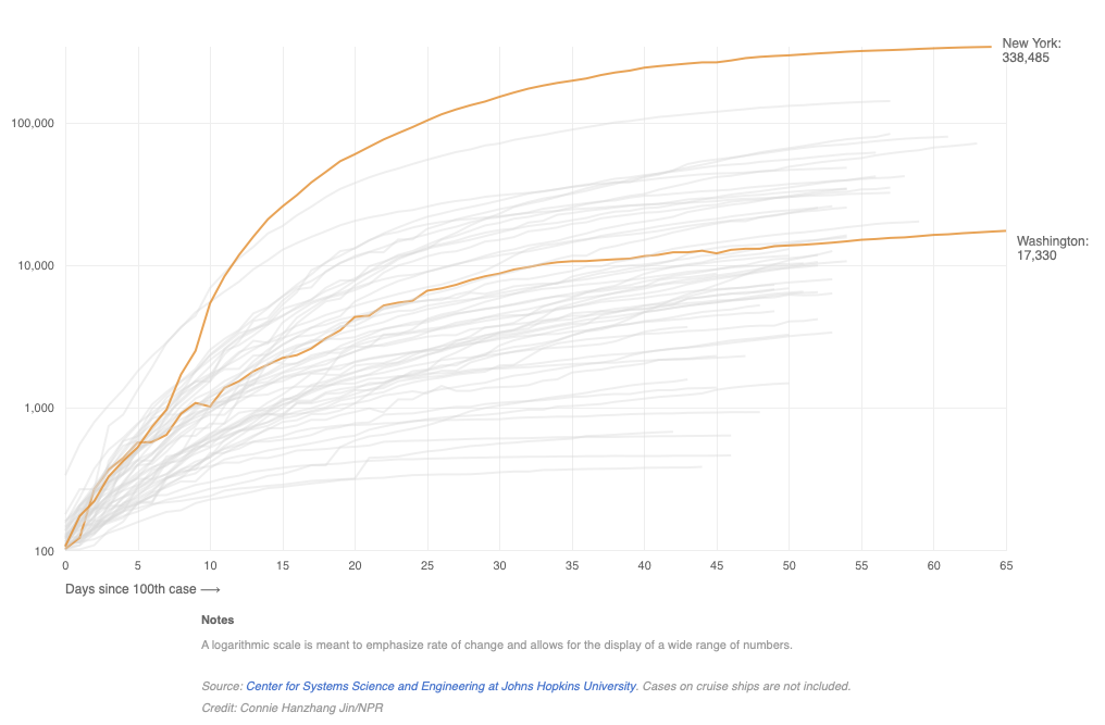
Figure 8.2: Growth in COVID-19 cases by state
As the note at the bottom of Figure 8.2 states, one purpose of using a log scale is to effectively display a wide (or highly skewed) range of values (i.e., distribution). If the vertical axis of Figure 8.2 was not in log scale, and instead in the scale of absolute/raw counts, then the different states would be so far dispersed from each other so as to make the graph impractical to insert into a document. Instead, the vertical graph actually ranges from only 2 to 5, not 100 to 10,000. How?
Log base 10 of a given number returns the power that 10 would need to raised to to equal the given number. Log base 10 of 100 equals 2 because 10 squared equals 100. Extending this logic:
\[log_{10}1,000=3 \leftrightarrow 10^3=1,000\]
\[log_{10}10,000=4 \leftrightarrow 10^4=10,000\] \[log_{10}100,000=5 \leftrightarrow 10^5=100,000\]
and now a variable that ranges between 100 and 100,000 has a more manageable range between 2 and 5.
Also, what was an exponential increase in cases as days along the x-axis increases is now a proportional increase. For example, note that from day 0 (since the 100th case) to day 10, the trend line for New York is roughly linear. Equal incremental increases in days correspond to an equal incremental increase in cases rescaled to log base 10. Without the log scale, the slope of the line would be extremely exponential. Instead, the line is roughly linear. This conversion of a nonlinear relationship to a linear one has consequences for how we interpret regression models that use variables transformed into a log scale. Understanding those consequences begins with understanding rates of change rather than absolute change.
8.3.2 Percent v percentage point change
The rate of change relevant to log transformations is percent change. The equation for percent change is shown below.
\[\begin{equation} PctChange = {\frac{NewValue-OldValue}{OldValue}} \times 100 \tag{8.7} \end{equation}\]
For example, if the number of COVID cases increase from 10,000 to 15,000 in one day, the absolute change in cases is 5,000. The percent change is
\[\frac{(15,000-10,000)}{10,000} \times 100 = 50\]
an increase of 50%, or half of the original value. Note that, in absolute terms, a percent change is not constant across starting values. If the next day experienced another 50% increase in cases from a starting value of 15,000, then the new value will be 22,500 (half of 15,000 is 7,500; 15,000 plus 7,500 equals 22,500). From 10,000 cases, a 50% increase results in a 5,000 increase in cases.
A nonlinear absolute change can be expressed in a linear/constant percent change.
A common cause of confusion is the difference between a percent change and a percentage point change. This occurs when we discuss the change in a variable that is already expressed as a percent. For example, if the U.S. unemployment rate increases from 4% to 15% during the COVID-19 pandemic, that’s an absolute change of 11 percentage points. The unemployment rate is expressed in units of percentage points, so a unit change is a percentage point change.
A percent change in a variable expressed in percentage points works just like any other variable. An increase from 4% to 15% in the unemployment rate is a 275% change (\(\frac{15-4}{4} \times 100 = 275\)).
Another example: suppose a political poll is taken to assess the job approval of President Joe Biden. Suppose Joe’s approval rating increased from 53% to 60%. Would we say Joe’s approval increased 7%? No! His approval increased 7 percentage points. A 7% increase would be an increase from 53% to 56.7% (\(53 \times 1.07 = 56.7\)). In percent change terms, an increase from 53% to 60% is a 13.2% increase (\(\frac{60-53}{53} \times 100 = 13.2\)).
As we have seen in previous examples of regression, when we include a variable that is not log-transformed, regression estimates the unit change in \(y\) given a unit change in \(x\). If a variable is expressed in units of percentages like unemployment or poverty, then a unit change for those variables is a percentage point change.
Including a log-transformed variable in regression estimates percent changes in the variable(s) we transformed.
One reason we may prefer to use percent change is if the variable in question has some underlying impact that differs depending on the initial value from which it changed. This too applies to measures of wealth or income. Suppose we estimate that a policy will, on average, increase peoples’ incomes by 12,000 dollars. This average unit change does not quite capture the benefit of the policy. Imagine a society of two people. One person earns 20,000 dollars per year and the other earns 80,000 dollars. That 12,000 likely has a greater positive impact on the low-income individual than it does the high-income individual. Consequently, this can be expressed in percent change. The 12,000 represents a 60% increase in income for the low-income individual and 15% for the high-income individual.
8.3.3 Why logs in regression
To summarize, we may want to use logs in regression if
- it is preferable to express change in percentages rather than units
- a variable we intend to include has a skewed distribution
- we theorize the relationship between two variables follows a logarithmic path
Let’s consider these last two reasons further. As was mentioned, log scales allow us to compare numbers that are very far apart, as seen in Figure 8.2. If the scale for COVID cases were left in constant units, New York and a few other states would be so far above most other states that it would be difficult to fit in a sensible graph. Using logs condensed or pulled those extreme numbers back to a more compact distribution.
As will become clear in the next section on inference, using a sample to make valid conclusions about a population relies heavily on the normal distribution, which was introduced in Chapter 4. In a similar sense, we want the variables we use for inference to be approximately normally distributed because extreme values of a skewed distribution can impose undue influence on our results. Log-transformations can transform a skewed distribution to be more normal.
For instance, variables that measure income or wealth tend to be right-skewed. Figure 8.3 shows the distribution of GDP per capita across most countries in multiple years. Clearly this distribution is not normal and skewed to the right. It is difficult to see because there are so few cases, but some countries have GDP per capita near or more than $120,000.
Figure 8.4 shows the distribution if we convert GDP per capita to a log scale (log10 was used but any log scale will achieve the same normalization). Now we have a more normal distribution. This is desirable in statistics.
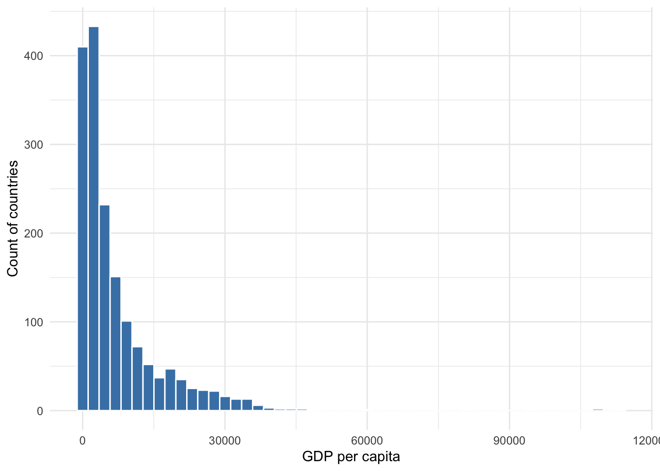
Figure 8.3: Distribution of GDP per capita
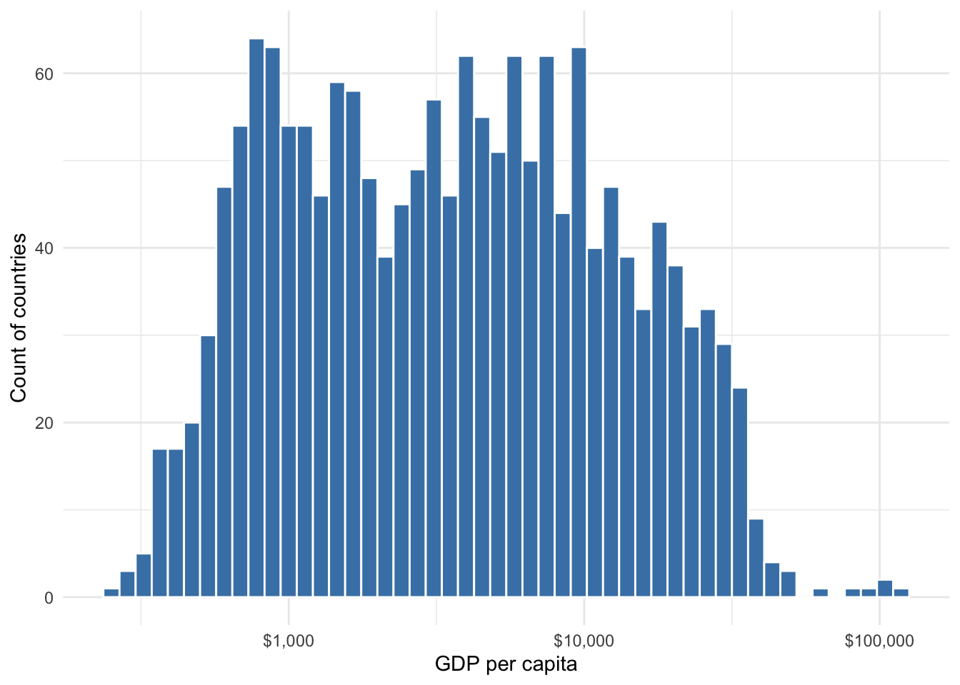
Figure 8.4: Distribution of log10 GDP per capita
The third reason for using logs concerns theory, which should always inform the choices we make in statistics. When choosing how to model the relationship between an outcome and an explanatory variable, if past research, experience, visualization of data, or intuition tells us that the outcome changes dramatically at first, then begins to flatten, a logarithmic transformation should be used.
For example, suppose we wish to examine the relationship between national wealth and life expectancy. Intuitively, we expect this relationship to be positive–as wealth increases, life expectancy should increase. Also, life expectancy has some natural ceiling, so it cannot increase indefinitely, and we may expect relatively small increases from low levels of wealth to have much greater impacts on life expectancy then similar increases from high levels of wealth.
Figure 8.5 provides a scatter plot of GDP per capita and life expectancy in their original units. Note the rapid increase then plateau in life expectancy. A regression line would not fit these data well.
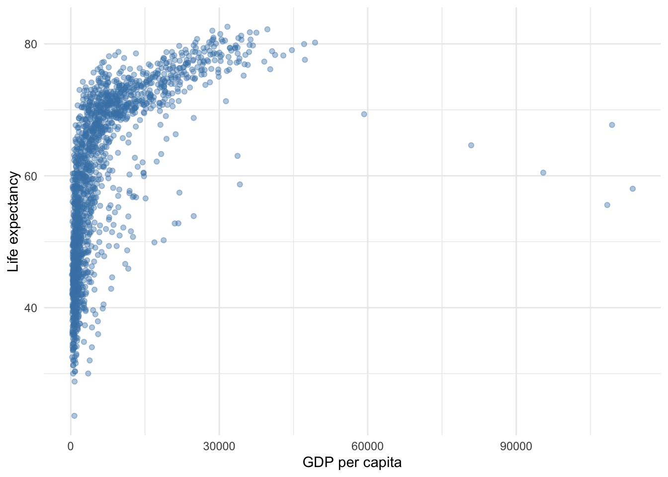
Figure 8.5: Relationship between wealth and life expectancy using unit scale
Using a log transformation in an association between two variables does not change the underlying data or relationship, but it does transform the pattern of points to be more linear, thus allowing a linear regression line to do a better job modeling the relationship. Figure 8.6 uses the same data but GDP per capita has been transformed to log scale. This simple change makes a big difference for the validity of any conclusions we may make regarding the relationship between wealth and life expectancy.
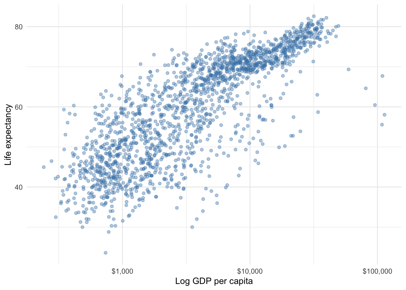
Figure 8.6: Relationship between wealth and life expectancy using log scale
8.3.4 Using log models
There are three variations of the log model:
- Level-log: log transforming one or more explanatory variables but not the outcome
- Log-level: log transforming the outcome but not an explanatory variable
- Log-log: log transforming the outcome and an explanatory variable
Each model fits slightly different patterns of association best but they share the general pattern of a pronounced initial increase or decrease followed by a plateau. If past research, visuals, or theory does not lead us to choose one model over the other, one option is to compare the goodness-of-fit between the three, choosing the one with the highest \(R^2\) or lowest RMSE.
One last point before presenting each of the models and how to interpret: using the logarithmic transformation uses a special log scale called the natural log, often denoted as \(ln\), as opposed to, say, \(log_{10}\) or \(log_2\). You do not need to concern yourself with the mathematical properties of the natural log. Just know that the natural log is what is used in regression to transform unit changes to percent changes.
Log-log
The log-log model is somewhat special among the three variations because it estimates a commonly used measure in economic or policy analyses–the elasticity. You may have already learned in policy analysis courses that the elasticity is the percent change in an outcome given a one percent change in the explanatory variable.
Equation (8.8) presents a generic log-log model. Log-log is simply meant to convey that we logged our outcome and logged at least one explanatory variable.
\[\begin{equation} ln(y)=\beta_0 + \beta_1ln(x_1) + \beta_2x_2 + \cdots + \beta_kx_k + \epsilon \tag{8.8} \end{equation}\]
Thus, the sample equation is
\[\begin{equation} \hat{ln(y)}=b_0 + b_1ln(x_1) + b_2x_2 + \cdots + b_kx_k \tag{8.9} \end{equation}\]
When we obtain an estimate for \(b_1\) we can plug it into the following template
On average, a one percent change in \(x_1\) is associated with a \(b_1\) percent change in \(y\), all else equal.
Or, if we wanted to report using elasticity language, assuming our audience understands what we are talking about:
According to the results, the \(x_1\) elasiticy of \(y\) is \(b_1\).
Level-log
Equation (8.10) presents a generic level-log model. Level-log is simply meant to convey that we logged at least one explanatory variable.
\[\begin{equation} y=\beta_0 + \beta_1ln(x_1) + \beta_2x_2 + \cdots + \beta_kx_k + \epsilon \tag{8.10} \end{equation}\]
Thus, the sample equation is
\[\begin{equation} \hat{y}=b_0 + b_1ln(x_1) + b_2x_2 + \cdots + b_kx_k \tag{8.11} \end{equation}\]
When we obtain an estimate for \(b_1\) we can plug it into the following template
On average, a one percent change in \(x_1\) is associated with a \(\frac{b_1}{100}\) unit change in \(y\), all else equal.
Or, if dividing our estimate by 100 results in too small of a number to report, we can say the following
On average, a doubling of \(x_1\) is associated with a \(b_1\) unit change in \(y\), all else equal.
because a doubling is equal to a 100 percent increase. Multiplying \(\frac{b_1}{100}\) by 100 cancels out the 100 in the denominator, leaving us with just \(b_1\).
Log-level
Equation (8.12) presents a generic log-level model. Log-level is simply meant to convey that we logged our outcome.
\[\begin{equation} ln(y)=\beta_0 + \beta_1x_1 + \beta_2x_2 + \cdots + \beta_kx_k + \epsilon \tag{8.12} \end{equation}\]
Thus, the sample equation is
\[\begin{equation} \hat{ln(y)}=b_0 + b_1x_1 + b_2x_2 + \cdots + b_kx_k \tag{8.13} \end{equation}\]
When we obtain an estimate for \(b_1\) we can plug it into the following template
On average, a one unit change in \(x_1\) is associated with a \(b_1 \times 100\) percent change in \(y\), all else equal.
Example
Let’s continue our investigation of national life expectancy using the various log models. Suppose we are interested in using the following base model for the three varieties of log models. Continent is included because perhaps we think it will capture some geographical, social, and/or cultural differences that impact life expectancy.
\[\begin{equation} LifeExp=\beta_0 + \beta_1GDPpercap + \beta_2Continent + \epsilon \tag{8.14} \end{equation}\]
The following tables present results for each of the three log models.
| term | estimate | std_error | statistic | p_value | lower_ci | upper_ci |
|---|---|---|---|---|---|---|
| intercept | 3.062 | 0.026 | 117.692 | 0 | 3.011 | 3.113 |
| log(gdpPercap) | 0.112 | 0.004 | 31.843 | 0 | 0.105 | 0.119 |
| continent: Americas | 0.133 | 0.011 | 12.519 | 0 | 0.112 | 0.154 |
| continent: Asia | 0.110 | 0.009 | 12.037 | 0 | 0.092 | 0.128 |
| continent: Europe | 0.166 | 0.012 | 14.357 | 0 | 0.143 | 0.189 |
| continent: Oceania | 0.152 | 0.029 | 5.187 | 0 | 0.095 | 0.210 |
| term | estimate | std_error | statistic | p_value | lower_ci | upper_ci |
|---|---|---|---|---|---|---|
| intercept | 2.317 | 1.359 | 1.704 | 0.088 | -0.349 | 4.983 |
| log(gdpPercap) | 6.422 | 0.183 | 35.003 | 0.000 | 6.062 | 6.782 |
| continent: Americas | 7.015 | 0.554 | 12.652 | 0.000 | 5.927 | 8.102 |
| continent: Asia | 5.912 | 0.477 | 12.400 | 0.000 | 4.977 | 6.847 |
| continent: Europe | 9.577 | 0.604 | 15.855 | 0.000 | 8.392 | 10.762 |
| continent: Oceania | 9.213 | 1.536 | 5.999 | 0.000 | 6.201 | 12.226 |
| term | estimate | std_error | statistic | p_value | lower_ci | upper_ci |
|---|---|---|---|---|---|---|
| intercept | 3.856 | 0.006 | 601.881 | 0 | 3.843 | 3.869 |
| gdpPercap | 0.000 | 0.000 | 16.374 | 0 | 0.000 | 0.000 |
| continent: Americas | 0.250 | 0.011 | 22.054 | 0 | 0.228 | 0.272 |
| continent: Asia | 0.160 | 0.010 | 15.322 | 0 | 0.140 | 0.181 |
| continent: Europe | 0.311 | 0.012 | 26.383 | 0 | 0.288 | 0.334 |
| continent: Oceania | 0.316 | 0.034 | 9.381 | 0 | 0.250 | 0.382 |
Our log-log results indicate that a one percent increase in GDP per capita is associated with a 0.11 percent increase in life expectancy, on average and controlling for continent.
Our level-log results indicate that a one percent increase in GDP per capita is associated with an increase in life expectancy of 0.06 years.
Our log-level results indicate that a one dollar increase in GDP per capita is associated with a indiscernible percent increase in life expectancy. Changing GDP per capita from dollars to something like thousands of dollars would probably give an estimate that doesn’t round to 0.
The continent estimates can be interpreted in similar fashion, remembering that with categorical variables, the estimate of each level of the variable is relative to the base comparison excluded from the equation. In this example, Africa is the base comparison. Let’s focus on Asia for interpretation.
Our log-log results indicate that life expectancy in Asia is 11% greater than life expectancy in Africa. Since a dummy variable can only change from 0 to 1, this is equivalent to a 100 percent change. Therefore, we must multiply our estimate by 100.
Our level-log results indicate that life expectancy in Asia is 5.9 years greater than life expectancy in Africa. Lastly, our log-level results indicate that life expectancy in Asia is 16% greater than life expectancy in Africa.
To learn how to include nonlinear variables in regression using R, proceed to Chapter 22.